[wpf] WPF TabItem Header Styling

I'm trying to style a TabControl and have got 75% of the way there, but I'm having difficulty styling the actual TabItems:

enter image description here

What I am trying to achieve is remove the default ContentPresenter so that I can make the tab items partially transparent with rounded edges instead of the place holder red and green i have now.

I'm sure it's probably not that difficult, but I just can't figure it out so any help would be most appreciated!

Here's the XAML for the TabControl so far:

<TabControl TabStripPlacement="Left" HorizontalAlignment="Stretch" BorderBrush="#41020202">
  <TabControl.BitmapEffect>
    <DropShadowBitmapEffect Color="Black" Direction="270"/>
  </TabControl.BitmapEffect>  
  <TabControl.Resources>    
    <Style TargetType="{x:Type TabItem}">
      <Setter Property="BorderThickness" Value="0"/>      
      <Setter Property="Padding" Value="0" />      
      <Setter Property="HeaderTemplate">        
        <Setter.Value>          
          <DataTemplate>        
            <Border x:Name="grid" Background="Red">
              <ContentPresenter>
                <ContentPresenter.Content>
                  <TextBlock Margin="4" FontSize="15" Text="{TemplateBinding Content}"/>
                </ContentPresenter.Content>             
                <ContentPresenter.LayoutTransform>                
                  <RotateTransform Angle="270" />              
                </ContentPresenter.LayoutTransform>            
              </ContentPresenter>  
            </Border>        
            <DataTemplate.Triggers>
              <DataTrigger Binding="{Binding RelativeSource={RelativeSource Mode=FindAncestor,AncestorType={x:Type TabItem}},Path=IsSelected}" Value="True">
                <Setter TargetName="grid" Property="Background" Value="Green"/>
              </DataTrigger>
            </DataTemplate.Triggers>
          </DataTemplate>        
        </Setter.Value>      
      </Setter>    
    </Style>  
  </TabControl.Resources>
  <TabControl.Background>
    <RadialGradientBrush Center="-0.047,0.553" GradientOrigin="-0.047,0.553" RadiusY="1.231" RadiusX="0.8">
      <GradientStop Offset="1" Color="#06FFFFFF"/>
      <GradientStop Color="#14FFFFFF"/>
    </RadialGradientBrush>
  </TabControl.Background>  
  <TabItem Header="Tab Item 1" />  
  <TabItem Header="Tab Item 2" />  
  <TabItem Header="Tab Item 3" />  
  <TabItem Header="Tab Item 4" />
</TabControl>

This question is related to wpf xaml header styles tabcontrol

The answer is


Try this style instead, it modifies the template itself. In there you can change everything you need to transparent:

<Style TargetType="{x:Type TabItem}">
  <Setter Property="Template">
    <Setter.Value>
      <ControlTemplate TargetType="{x:Type TabItem}">
        <Grid>
          <Border Name="Border" Margin="0,0,0,0" Background="Transparent"
                  BorderBrush="Black" BorderThickness="1,1,1,1" CornerRadius="5">
            <ContentPresenter x:Name="ContentSite" VerticalAlignment="Center"
                              HorizontalAlignment="Center"
                              ContentSource="Header" Margin="12,2,12,2"
                              RecognizesAccessKey="True">
              <ContentPresenter.LayoutTransform>
            <RotateTransform Angle="270" />
          </ContentPresenter.LayoutTransform>
        </ContentPresenter>
          </Border>
        </Grid>
        <ControlTemplate.Triggers>
          <Trigger Property="IsSelected" Value="True">
            <Setter Property="Panel.ZIndex" Value="100" />
            <Setter TargetName="Border" Property="Background" Value="Red" />
            <Setter TargetName="Border" Property="BorderThickness" Value="1,1,1,0" />
          </Trigger>
          <Trigger Property="IsEnabled" Value="False">
            <Setter TargetName="Border" Property="Background" Value="DarkRed" />
            <Setter TargetName="Border" Property="BorderBrush" Value="Black" />
            <Setter Property="Foreground" Value="DarkGray" />
          </Trigger>
        </ControlTemplate.Triggers>
      </ControlTemplate>
    </Setter.Value>
  </Setter>
</Style>

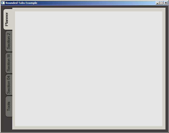
While searching for a way to round tabs, I found Carlo's answer and it did help but I needed a bit more. Here is what I put together, based on his work. This was done with MS Visual Studio 2015.

The Code:

<Window x:Class="MainWindow"
        xmlns="http://schemas.microsoft.com/winfx/2006/xaml/presentation"
        xmlns:x="http://schemas.microsoft.com/winfx/2006/xaml"
        xmlns:d="http://schemas.microsoft.com/expression/blend/2008"
        xmlns:mc="http://schemas.openxmlformats.org/markup-compatibility/2006"
        xmlns:local="clr-namespace:MealNinja"
        mc:Ignorable="d"
        Title="Rounded Tabs Example" Height="550" Width="700" WindowStartupLocation="CenterScreen" FontFamily="DokChampa" FontSize="13.333" ResizeMode="CanMinimize" BorderThickness="0">
    <Window.Effect>
        <DropShadowEffect Opacity="0.5"/>
    </Window.Effect>
    <Grid Background="#FF423C3C">
        <TabControl x:Name="tabControl" TabStripPlacement="Left" Margin="6,10,10,10" BorderThickness="3">
            <TabControl.Resources>
                <Style TargetType="{x:Type TabItem}">
                    <Setter Property="Template">
                        <Setter.Value>
                            <ControlTemplate TargetType="{x:Type TabItem}">
                                <Grid>
                                    <Border Name="Border" Background="#FF6E6C67" Margin="2,2,-8,0" BorderBrush="Black" BorderThickness="1,1,1,1" CornerRadius="10">
                                        <ContentPresenter x:Name="ContentSite" ContentSource="Header" VerticalAlignment="Center" HorizontalAlignment="Center" Margin="2,2,12,2" RecognizesAccessKey="True"/>
                                    </Border>
                                    <Rectangle Height="100" Width="10" Margin="0,0,-10,0" Stroke="Black" VerticalAlignment="Bottom" HorizontalAlignment="Right" StrokeThickness="0" Fill="#FFD4D0C8"/>
                                </Grid>
                                <ControlTemplate.Triggers>
                                    <Trigger Property="IsSelected" Value="True">
                                        <Setter Property="FontWeight" Value="Bold" />
                                        <Setter TargetName="ContentSite" Property="Width" Value="30" />
                                        <Setter TargetName="Border" Property="Background" Value="#FFD4D0C8" />
                                    </Trigger>
                                    <Trigger Property="IsEnabled" Value="False">
                                        <Setter TargetName="Border" Property="Background" Value="#FF6E6C67" />
                                    </Trigger>
                                    <Trigger Property="IsMouseOver" Value="true">
                                        <Setter Property="FontWeight" Value="Bold" />
                                    </Trigger>
                                </ControlTemplate.Triggers>
                            </ControlTemplate>
                        </Setter.Value>
                    </Setter>
                    <Setter Property="HeaderTemplate">
                        <Setter.Value>
                            <DataTemplate>
                                <ContentPresenter Content="{TemplateBinding Content}">
                                    <ContentPresenter.LayoutTransform>
                                        <RotateTransform Angle="270" />
                                    </ContentPresenter.LayoutTransform>
                                </ContentPresenter>
                            </DataTemplate>
                        </Setter.Value>
                    </Setter>
                    <Setter Property="Background" Value="#FF6E6C67" />
                    <Setter Property="Height" Value="90" />
                    <Setter Property="Margin" Value="0" />
                    <Setter Property="Padding" Value="0" />
                    <Setter Property="FontFamily" Value="DokChampa" />
                    <Setter Property="FontSize" Value="16" />
                    <Setter Property="VerticalAlignment" Value="Top" />
                    <Setter Property="HorizontalAlignment" Value="Right" />
                    <Setter Property="UseLayoutRounding" Value="False" />
                </Style>
                <Style x:Key="tabGrids">
                    <Setter Property="Grid.Background" Value="#FFE5E5E5" />
                    <Setter Property="Grid.Margin" Value="6,10,10,10" />
                </Style>
            </TabControl.Resources>
            <TabItem Header="Planner">
                <Grid Style="{StaticResource tabGrids}"/>
            </TabItem>
            <TabItem Header="Section 2">
                <Grid Style="{StaticResource tabGrids}"/>
            </TabItem>
            <TabItem Header="Section III">
                <Grid Style="{StaticResource tabGrids}"/>
            </TabItem>
            <TabItem Header="Section 04">
                <Grid Style="{StaticResource tabGrids}"/>
            </TabItem>
            <TabItem Header="Tools">
                <Grid Style="{StaticResource tabGrids}"/>
            </TabItem>
        </TabControl>
    </Grid>
</Window>

Screenshot:

enter image description here


Examples related to wpf

Error: the entity type requires a primary key Reportviewer tool missing in visual studio 2017 RC Pass command parameter to method in ViewModel in WPF? Calling async method on button click Setting DataContext in XAML in WPF How to resolve this System.IO.FileNotFoundException System.Windows.Markup.XamlParseException' occurred in PresentationFramework.dll? Binding an Image in WPF MVVM How to bind DataTable to Datagrid Setting cursor at the end of any text of a textbox

Examples related to xaml

Setting DataContext in XAML in WPF Change color of Button when Mouse is over Implement Validation for WPF TextBoxes Use StringFormat to add a string to a WPF XAML binding How to format number of decimal places in wpf using style/template? How to set DataGrid's row Background, based on a property value using data bindings WPF C# button style How to clear a textbox once a button is clicked in WPF? Add Items to Columns in a WPF ListView Binding ConverterParameter No 'Access-Control-Allow-Origin' header in Angular 2 app How to add header row to a pandas DataFrame How can I make sticky headers in RecyclerView? (Without external lib) Adding header to all request with Retrofit 2 Python Pandas Replacing Header with Top Row Request header field Access-Control-Allow-Headers is not allowed by Access-Control-Allow-Headers Pythonically add header to a csv file fatal error C1010 - "stdafx.h" in Visual Studio how can this be corrected? correct PHP headers for pdf file download How to fix a header on scroll

Examples related to styles

How to manage Angular2 "expression has changed after it was checked" exception when a component property depends on current datetime React Native Border Radius with background color How to change DatePicker dialog color for Android 5.0 How to change line color in EditText Valid values for android:fontFamily and what they map to? Overriding css style? WPF C# button style How to stick <footer> element at the bottom of the page (HTML5 and CSS3)? Binding ConverterParameter CSS align images and text on same line

Examples related to tabcontrol

Check if a specific tab page is selected (active) Activate tabpage of TabControl Hiding and Showing TabPages in tabControl WPF TabItem Header Styling Is there Selected Tab Changed Event in the standard WPF Tab Control How to hide TabPage from TabControl How can I disable a tab inside a TabControl?