I have not completely tested my solution, but it seems to work great.
My HTML is simply:
<label class="checkbox"><input type="checkbox" value="0000">0000 - 0100</label>
I then set all checkboxes to 24px for both height and width. To make the text aligned I make the label's line-height also 24px and assign vertical-align: top; like so:
EDIT: After IE testing I added vertical-align: bottom; to the input and changed the label's CSS. You may find you need a conditional IE css case to sort out padding - but the text and box are inline.
_x000D_
_x000D_
_x000D_
_x000D_
input[type="checkbox"] {_x000D_
    width: 24px;_x000D_
    height: 24px;_x000D_
    vertical-align: bottom;_x000D_
}_x000D_
label.checkbox {_x000D_
    vertical-align: top;_x000D_
    line-height: 24px;_x000D_
    margin: 2px 0;_x000D_
    display: block;_x000D_
    height: 24px;_x000D_
}<label class="checkbox"><input type="checkbox" value="0000">0000 - 0100</label>_x000D_
<label class="checkbox"><input type="checkbox" value="0100">0100 - 0200</label>_x000D_
<label class="checkbox"><input type="checkbox" value="0200">0200 - 0300</label>_x000D_
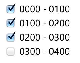
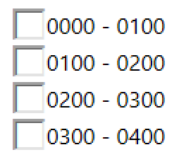
<label class="checkbox"><input type="checkbox" value="0300">0300 - 0400</label>If anyone finds that this doesn't work, please kindly let me know. Here is it in action (in Chrome and IE - apologies as screenshots were taken on retina and using parallels for IE):