[css] What's the difference between align-content and align-items?

Can anybody show me the difference between align-items and align-content?

This question is related to css layout flexbox alignment

The answer is


What I have learned from every answer and visiting the blog is

what is the cross axis and main axis

  • main axis is horizontal row and cross axis is vertical column - for flex-direction: row
  • main axis is vertical column and cross axis is horizontal row - for flex-direction: column

Now align-content and align-items

align-content is for the row, it works if the container has (more than one row) Properties of align-content

.container {
  align-content: flex-start | flex-end | center | space-between | space-around | space-evenly | stretch | start | end | baseline | first baseline | last baseline + ... safe | unsafe;
}

align-items is for the items in row Properties of align-items

.container {
  align-items: stretch | flex-start | flex-end | center | baseline | first baseline | last baseline | start | end | self-start | self-end + ... safe | unsafe;
}

For more reference visit to flex


From the example at flexboxfroggy.com:

align-content determines the spacing between lines

align-items determines how the items as a whole are aligned within the container.

When there is only one line, align-content has no effect


according to what I understood from here:

when you use align-item or justify-item, you are adjusting "the content inside a grid item along the column axis or row axis respectively.

But: if you use align-content or justify-content, you are setting the position a grid along the column axis or the row axis. it occurs when you have a grid in a bigger container and width or height are inflexible (using px).


align-content

align-content controls the cross-axis (i.e. vertical direction if the flex-direction is row, and horizontal if the flex-direction is column) positioning of multiple lines relative to each other.

(Think lines of a paragraph being vertically spread out, stacked toward the top, stacked toward the bottom. This is under a flex-direction row paradigm).

align-items

align-items controls the cross-axis of an individual line of flex elements.

(Think how an individual line of a paragraph is aligned, if it contains some normal text and some taller text like math equations. In that case, will it be the bottom, top, or center of each type of text in a line that will be aligned?)


The main difference is when the height of the elements are not the same! Then you can see how in the row, they are all center\end\start


Well I have examined them on my browser.

align-content can change a line's height for row direction or width for column when it's value is stretch, or add empty space between or around the lines for space-between, space-around, flex-start, flex-end values.

align-items can change items height or position inside the line's area. When items are not wrapped they have only one line which it's area is always stretched to the flex-box area (even if the items overflow), and align-content has no effect on a single line. So it has no effect on items that are not wrapped and only align-items can change items position or stretch them when all of them are on a single line.

However, if they are wrapped you have multiple lines and items inside each line. And if all items of each line have the same height (for row direction) that line's height will be equal to those items height and you don't see any effect by changing align-items value.

So if you want to affect items by align-items when your items are wrapped and have the same height (for row direction) first you have to use align-content with stretch value in order to expand the lines area.


I had the same confusion. After some tinkering based on many of the answers above, I can finally see the differences. In my humble opinion, the distinction is best demonstrated with a flex container that satisfies the following two conditions:

  1. The flex container itself has a height constraint (e.g., min-height: 60rem) and thus can become too tall for its content
  2. The child items enclosed in the container have uneven heights

Condition 1 helps me understand what content means relative to its parent container. When the content is flush with the container, we will not be able to see any positioning effects coming from align-content. It is only when we have extra space along the cross axis, we start to see its effect: It aligns the content relative to the boundaries of the parent container.

Condition 2 helps me visualize the effects of align-items: it aligns items relative to each other.


Here is a code example. Raw materials come from Wes Bos' CSS Grid tutorial (21. Flexbox vs. CSS Grid)

  • Example HTML:
  <div class="flex-container">
    <div class="item">Short</div>
    <div class="item">Longerrrrrrrrrrrrrr</div>
    <div class="item"></div>
    <div class="item" id="tall">This is Many Words</div>
    <div class="item">Lorem, ipsum.</div>
    <div class="item">10</div>
    <div class="item">Snickers</div>
    <div class="item">Wes Is Cool</div>
    <div class="item">Short</div>
  </div>
  • Example CSS:
.flex-container {
  display: flex;
  /*dictates a min-height*/
  min-height: 60rem;
  flex-flow: row wrap;
  border: 5px solid white;
  justify-content: center;
  align-items: center;
  align-content: flex-start;
 }

#tall {
  /*intentionally made tall*/
  min-height: 30rem;
}

.item {
  margin: 10px;
  max-height: 10rem;
}

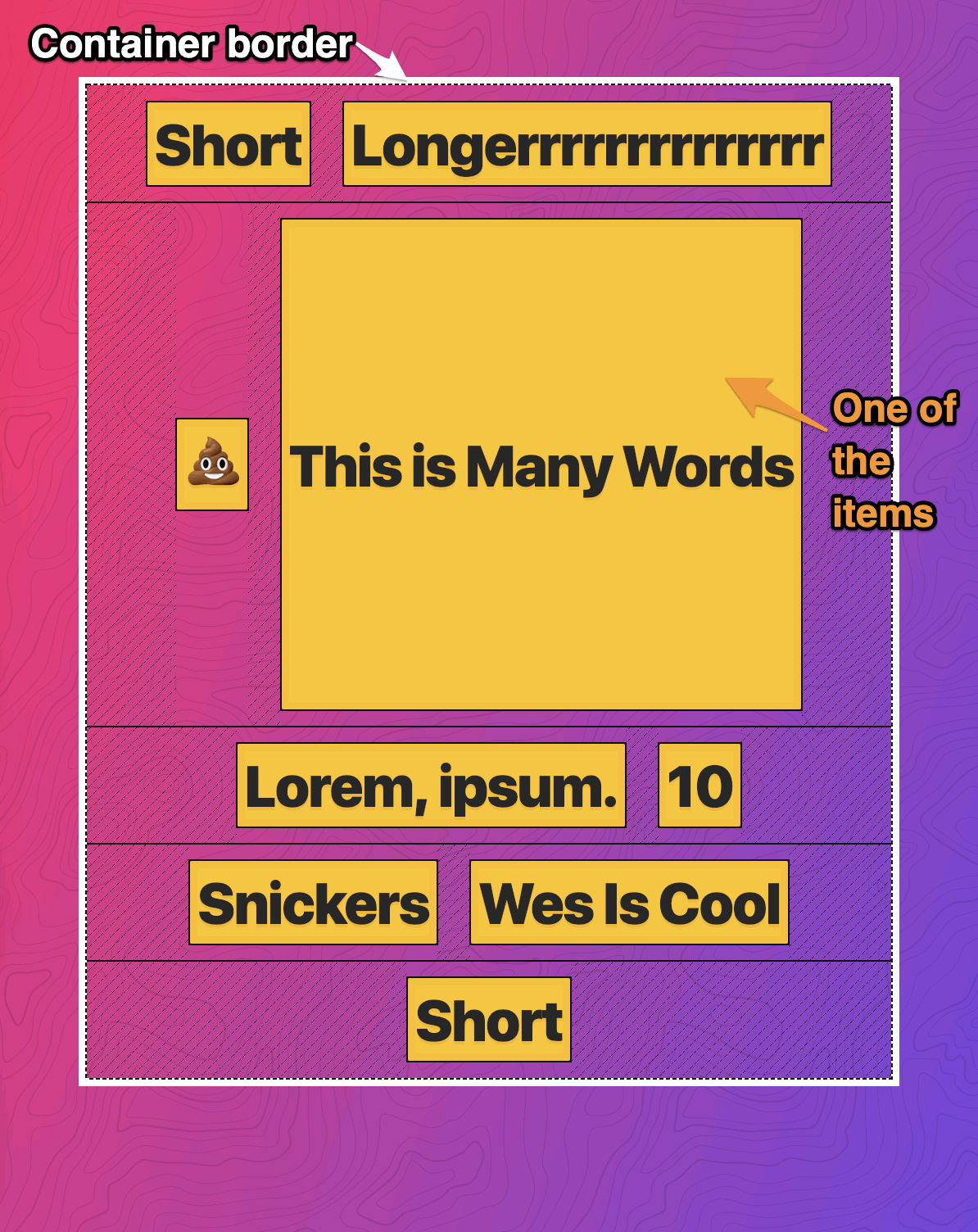
Example 1: Let's narrow the viewport so that the content is flush with the container. This is when align-content: flex-start; has no effects since the entire content block is tightly fit inside the container (no extra room for repositioning!)

Also, note the 2nd row--see how the items are center aligned among themselves.

enter image description here

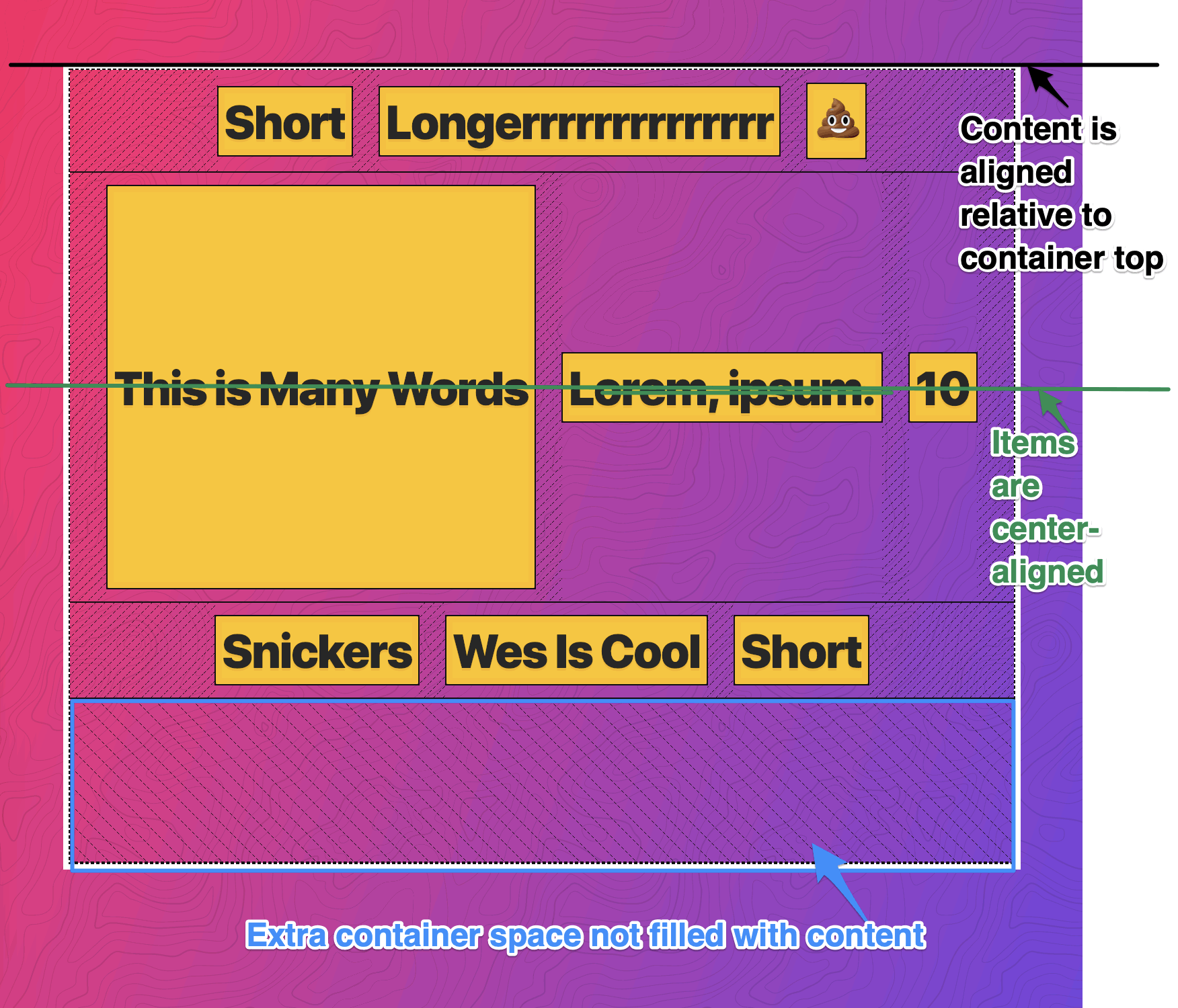
Example 2: As we widen the viewport, we no longer have enough content to fill the entire container. Now we start to see the effects of align-content: flex-start;--it aligns the content relative to the top edge of the container. enter image description here


These examples are based on flexbox, but the same principles are applicable to CSS grid. Hope this helps :)


The align-items property of flex-box aligns the items inside a flex container along the cross axis just like justify-content does along the main axis. (For the default flex-direction: row the cross axis corresponds to vertical and the main axis corresponds to horizontal. With flex-direction: column those two are interchanged respectively).

Here's an example of how align-items:center looks:

align-items: center

But align-content is for multi line flexible boxes. It has no effect when items are in a single line. It aligns the whole structure according to its value. Here's an example for align-content: space-around;: enter image description here

And here's how align-content: space-around; with align-items:center looks: enter image description here

Note the 3rd box and all other boxes in first line change to vertically centered in that line.

Here are some codepen links to play with:

http://codepen.io/asim-coder/pen/MKQWbb

http://codepen.io/asim-coder/pen/WrMNWR

Here's a super cool pen which shows and lets you play with almost everything in flexbox.


Having read some of the answers, they identify correctly that align-content takes no affect if the flex content is not wrapped. However what they don't understand is align-items still plays an important role when there is wrapped content:

In the following two examples, align-items is used to center the items within each row, then we change align-content to see it's effect.

Example 1:

align-content: flex-start;

enter image description here

Example 2:

    align-content: flex-end;

enter image description here

Here's the code:

<div class="container">
    <div class="child" style="height: 30px;">1</div>
    <div class="child" style="height: 50px;">2</div>
    <div class="child" style="height: 60px;">3</div>
    <div class="child" style="height: 40px;">4</div>
    <div class="child" style="height: 50px;">5</div>
    <div class="child" style="height: 20px;">6</div>
    <div class="child" style="height: 90px;">7</div>
    <div class="child" style="height: 50px;">8</div>
    <div class="child" style="height: 30px;">9</div>
    <div class="child" style="height: 40px;">10</div>
    <div class="child" style="height: 30px;">11</div>
    <div class="child" style="height: 60px;">12</div>
</div>

<style>
.container {
    display: flex;
    width: 300px;
    flex-flow: row wrap;
    justify-content: space-between;
    align-items: center;
    align-content: flex-end;
    background: lightgray;
    height: 400px;
}
.child {
    padding: 12px;
    background: red;
    border: solid 1px black;
}
</style>

First, align-items is for items in a single row. So for a single row of elements on main axis, align-items will align these items respective of each other and it will start with fresh perspective from the next row.

Now, align-content doesn't interfere with items in a row but with rows itself. Hence, align-content will try to align rows with respect to each other and flex container.

Check this fiddle : https://jsfiddle.net/htym5zkn/8/


Examples related to css

need to add a class to an element Using Lato fonts in my css (@font-face) Please help me convert this script to a simple image slider Why there is this "clear" class before footer? How to set width of mat-table column in angular? Center content vertically on Vuetify bootstrap 4 file input doesn't show the file name Bootstrap 4: responsive sidebar menu to top navbar Stylesheet not loaded because of MIME-type Force flex item to span full row width

Examples related to layout

This view is not constrained What's the difference between align-content and align-items? CSS Flex Box Layout: full-width row and columns Fill remaining vertical space with CSS using display:flex What is setContentView(R.layout.main)? How to change line color in EditText Scrolling a flexbox with overflowing content UICollectionView - Horizontal scroll, horizontal layout? How to style a div to be a responsive square? 100% width Twitter Bootstrap 3 template

Examples related to flexbox

Force flex item to span full row width vuetify center items into v-flex Equal height rows in CSS Grid Layout display: flex not working on Internet Explorer Center the content inside a column in Bootstrap 4 Vertical Align Center in Bootstrap 4 How to use zIndex in react-native Bootstrap 4 align navbar items to the right Does 'position: absolute' conflict with Flexbox? Make flex items take content width, not width of parent container

Examples related to alignment

How do I center text vertically and horizontally in Flutter? CSS align one item right with flexbox What's the difference between align-content and align-items? align images side by side in html How to align iframe always in the center How to make popup look at the centre of the screen? Responsive image align center bootstrap 3 How to align title at center of ActionBar in default theme(Theme.Holo.Light) Center align a column in twitter bootstrap How do I position an image at the bottom of div?