[html] How to add the text "ON" and "OFF" to toggle button

On my project I wanted to add a text on my existing toggle code.So I wanted like this, When toggles ON it should display the text "ON" and display the "OFF" text if toggles off. I can't change it to other toggle because it's already have a backend using it. I just wanted only to input "ON" and "OFF" text. Thank you.

Here is my code HTML:

<label class="switch"><input type="checkbox" id="togBtn"><div class="slider round"></span></div></label>

CSS:

.switch input {display:none;}

.slider {
  position: absolute;
  cursor: pointer;
  top: 0;
  left: 0;
  right: 0;
  bottom: 0;
  background-color: #ca2222;
  -webkit-transition: .4s;
  transition: .4s;
}

.slider:before {
  position: absolute;
  content: "";
  height: 26px;
  width: 26px;
  left: 4px;
  bottom: 4px;
  background-color: white;
  -webkit-transition: .4s;
  transition: .4s;
}

input:checked + .slider {
  background-color: #2ab934;
}

input:focus + .slider {
  box-shadow: 0 0 1px #2196F3;
}

input:checked + .slider:before {
  -webkit-transform: translateX(26px);
  -ms-transform: translateX(26px);
  transform: translateX(26px);
}

/* Rounded sliders */
.slider.round {
  border-radius: 34px;
}

.slider.round:before {
  border-radius: 50%;

This question is related to html css toggle

The answer is


Here I made a toggle button with CSS:

.switch {
  position: relative;
  display: inline-block;
  width: 100%;
  height: 34px;
}

.switch input {display:none;}

.slider {
  position: absolute;
  cursor: pointer;
  top: 0;
  left: 0;
  right: 0;
  bottom: 0;
  background-color: #ca2222;
  -webkit-transition: .4s;
  transition: .4s;
}

.slider:before {
  position: absolute;
  content: "";
  height: 26px;
  width: 26px;
  left: 4px;
  bottom: 4px;
  background-color: white;
  -webkit-transition: .4s;
  transition: .4s;
}

input:checked + .slider {
  background-color: #2ab934;
}

input:focus + .slider {
  box-shadow: 0 0 1px #2196F3;
}

input:checked + .slider:before {
  -webkit-transform: translateX(165px);
  -ms-transform: translateX(165px);
  transform: translateX(200px);
}

/*------ ADDED CSS ---------*/
.on
{
  display: none;
}

.on, .off
{
  color: white;
  position: absolute;
  transform: translate(-50%,-50%);
  top: 50%;
  left: 50%;
  font-size: 10px;
  font-family: Verdana, sans-serif;
}

input:checked+ .slider .on
{display: block;}

input:checked + .slider .off
{display: none;}

/*--------- END --------*/

/* Rounded sliders */
.slider.round {
  border-radius: 34px;
}

.slider.round:before {
  border-radius: 50%;}

Here is the HTML code of toggle button with text:

<input type="checkbox" id="togBtn">
<div class="slider round">
    <!--ADDED HTML -->
    <span class="on">BOOKED</span>
    <span class="off">AVAILABLE</span>
    <!--END-->
</div>

try this

_x000D_
_x000D_
.switch {_x000D_
  position: relative;_x000D_
  display: inline-block;_x000D_
  width: 60px;_x000D_
  height: 34px;_x000D_
}_x000D_
_x000D_
.switch input {display:none;}_x000D_
_x000D_
.slider {_x000D_
  position: absolute;_x000D_
  cursor: pointer;_x000D_
  top: 0;_x000D_
  left: 0;_x000D_
  right: 0;_x000D_
  bottom: 0;_x000D_
  background-color: #ccc;_x000D_
  -webkit-transition: .4s;_x000D_
  transition: .4s;_x000D_
}_x000D_
_x000D_
.slider:before {_x000D_
  position: absolute;_x000D_
  content: "";_x000D_
  height: 26px;_x000D_
  width: 26px;_x000D_
  left: 4px;_x000D_
  bottom: 4px;_x000D_
  background-color: white;_x000D_
  -webkit-transition: .4s;_x000D_
  transition: .4s;_x000D_
}_x000D_
_x000D_
input:checked + .slider {_x000D_
  background-color: #2196F3;_x000D_
}_x000D_
_x000D_
input:focus + .slider {_x000D_
  box-shadow: 0 0 1px #2196F3;_x000D_
}_x000D_
_x000D_
input:checked + .slider:before {_x000D_
  -webkit-transform: translateX(26px);_x000D_
  -ms-transform: translateX(26px);_x000D_
  transform: translateX(26px);_x000D_
}_x000D_
_x000D_
/* Rounded sliders */_x000D_
.slider.round {_x000D_
  border-radius: 34px;_x000D_
}_x000D_
_x000D_
.slider.round:before {_x000D_
  border-radius: 50%;_x000D_
}
_x000D_
<!doctype html>_x000D_
<html>_x000D_
<head>_x000D_
<meta charset="utf-8">_x000D_
<title>Untitled Document</title>_x000D_
</head>_x000D_
_x000D_
<body>_x000D_
_x000D_
<h2>Toggle Switch</h2>_x000D_
_x000D_
<label class="switch">_x000D_
  <input type="checkbox">_x000D_
  <div class="slider"></div>_x000D_
</label>_x000D_
_x000D_
<label class="switch">_x000D_
  <input type="checkbox" checked>_x000D_
  <div class="slider"></div>_x000D_
</label><br><br>_x000D_
_x000D_
<label class="switch">_x000D_
  <input type="checkbox">_x000D_
  <div class="slider round"></div>_x000D_
</label>_x000D_
_x000D_
<label class="switch">_x000D_
  <input type="checkbox" checked>_x000D_
  <div class="slider round"></div>_x000D_
</label>_x000D_
_x000D_
</body>_x000D_
</html>
_x000D_
_x000D_
_x000D_


Have a look on this example

_x000D_
_x000D_
.switch {
        width: 50px;
        height: 17px;
        position: relative;
        display: inline-block;
    }

        .switch input {
            display: none;
        }

        .switch .slider {
            position: absolute;
            top: 0;
            bottom: 0;
            right: 0;
            left: 0;
            cursor: pointer;
            background-color: #e7ecf1;
            border-radius: 30px !important;
            border: 0;
            padding: 0;
            display: block;
            margin: 12px 10px;
            min-height: 11px;
        }

            .switch .slider:before {
                position: absolute;
                background-color: #aaa;
                height: 15px;
                width: 15px;
                content: "";
                left: 0px;
                bottom: -2px;
                border-radius: 50%;
                transition: ease-in-out .5s;
            }

            .switch .slider:after {
                content: "";
                color: white;
                display: block;
                position: absolute;
                transform: translate(-50%,-50%);
                top: 50%;
                left: 70%;
                transition: all .5s;
                font-size: 10px;
                font-family: Verdana,sans-serif;
            }

        .switch input:checked + .slider:after {
            transition: all .5s;
            left: 30%;
            content: "";
        }

        .switch input:checked + .slider {
            background-color: #d3d6d9;
        }

            .switch input:checked + .slider:before {
                transform: translateX(15px);
                background-color: #26a2ac;
            }
_x000D_
<label class="switch">
                                        <input type="checkbox" />
                                        <div class="slider"></div>
                                    </label>
_x000D_
_x000D_
_x000D_


    .switch
    {
            width: 50px;
            height: 30px;
            position: relative;
            display:inline-block;
    }

    .switch input
    {
            display: none;
    }

    .slider
    {
            position: absolute;
            top: 0;
            bottom: 0;
            right: 0;
            left: 0;
            cursor: pointer;
            background-color: gray;
            border-radius: 30px;

    }
    .slider:before
    {

        position: absolute;
        background-color: #fff;
        height: 20px;
        width: 20px;
        content: "";
        left: 5px;
        bottom: 5px;
        border-radius: 50%;
        transition: ease-in-out .5s;
    }

    .slider:after
    {
        content: "Off";

        color: white;
        display: block;
        position: absolute;
        transform: translate(-50%,-50%);
        top: 50%;
        left: 70%;
        transition: all .5s;
        font-size: 10px;
        font-family: Verdana,sans-serif;
    }

    input:checked + .slider:after
    {
        transition: all .5s;
        left: 30%;
        content: "On"

    }
    input:checked + .slider
    {
        background-color: blue;

    }

    input:checked + .slider:before
    {
        transform: translateX(20px);
    }


    **The HTML CODE**

    <label class="switch">

                <input type="checkbox"/>

                 <div class="slider">

                </div>
        </label>


If You want to add long text like activate or Deactivate

just make few changes 

.switch
{
        width:90px
}
.slider:after
{
     left: 60%; //as you want in percenatge
}
input:checked + .slider:after
{
       left:40%; //exactly opposite of .slider:after 
}

and last

input:checked + .slider:before
{
    transform: translateX(60px); //as per your choice but 60px is perfect
}

content as per your choice where you have witten "On" and "Off"


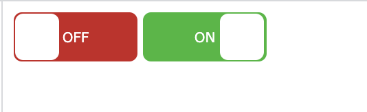
Square version of the toggle can be added by modifying the border radius

_x000D_
_x000D_
.switch {
  position: relative;
  display: inline-block;
  width: 90px;
  height: 36px;
}

.switch input {display:none;}

.slider {
  position: absolute;
  cursor: pointer;
  top: 0;
  left: 0;
  right: 0;
  bottom: 0;
  background-color: #ca2222;
  -webkit-transition: .4s;
  transition: .4s;
  border-radius: 6px;
}

.slider:before {
  position: absolute;
  content: "";
  height: 34px;
  width: 32px;
  top: 1px;
  left: 1px;
  right: 1px;
  bottom: 1px;
  background-color: white;
  transition: 0.4s;
  border-radius: 6px;
}

input:checked + .slider {
  background-color: #2ab934;
}

input:focus + .slider {
  box-shadow: 0 0 1px #2196F3;
}

input:checked + .slider:before {
  -webkit-transform: translateX(26px);
  -ms-transform: translateX(26px);
  transform: translateX(55px);
}

.slider:after {
  content:'OFF';
  color: white;
  display: block;
  position: absolute;
  transform: translate(-50%,-50%);
  top: 50%;
  left: 50%;
  font-size: 10px;
  font-family: Verdana, sans-serif;
}
input:checked + .slider:after {
  content:'ON';
}
_x000D_
<label class="switch">
  <input type="checkbox" id="togBtn">
  <div class="slider"></div>
</label>
_x000D_
_x000D_
_x000D_

enter image description here


You could do it like this:

_x000D_
_x000D_
.switch {
  position: relative;
  display: inline-block;
  width: 90px;
  height: 34px;
}

.switch input {display:none;}

.slider {
  position: absolute;
  cursor: pointer;
  top: 0;
  left: 0;
  right: 0;
  bottom: 0;
  background-color: #ca2222;
  -webkit-transition: .4s;
  transition: .4s;
}

.slider:before {
  position: absolute;
  content: "";
  height: 26px;
  width: 26px;
  left: 4px;
  bottom: 4px;
  background-color: white;
  -webkit-transition: .4s;
  transition: .4s;
}

input:checked + .slider {
  background-color: #2ab934;
}

input:focus + .slider {
  box-shadow: 0 0 1px #2196F3;
}

input:checked + .slider:before {
  -webkit-transform: translateX(55px);
  -ms-transform: translateX(55px);
  transform: translateX(55px);
}

/*------ ADDED CSS ---------*/
.on
{
  display: none;
}

.on, .off
{
  color: white;
  position: absolute;
  transform: translate(-50%,-50%);
  top: 50%;
  left: 50%;
  font-size: 10px;
  font-family: Verdana, sans-serif;
}

input:checked+ .slider .on
{display: block;}

input:checked + .slider .off
{display: none;}

/*--------- END --------*/

/* Rounded sliders */
.slider.round {
  border-radius: 34px;
}

.slider.round:before {
  border-radius: 50%;}
_x000D_
<label class="switch">
 <input type="checkbox" id="togBtn">
 <div class="slider round">
  <!--ADDED HTML -->
  <span class="on">ON</span>
  <span class="off">OFF</span>
  <!--END-->
 </div>
</label>
_x000D_
_x000D_
_x000D_

Or pure CSS:

_x000D_
_x000D_
.switch {
  position: relative;
  display: inline-block;
  width: 90px;
  height: 34px;
}

.switch input {display:none;}

.slider {
  position: absolute;
  cursor: pointer;
  top: 0;
  left: 0;
  right: 0;
  bottom: 0;
  background-color: #ca2222;
  -webkit-transition: .4s;
  transition: .4s;
   border-radius: 34px;
}

.slider:before {
  position: absolute;
  content: "";
  height: 26px;
  width: 26px;
  left: 4px;
  bottom: 4px;
  background-color: white;
  -webkit-transition: .4s;
  transition: .4s;
  border-radius: 50%;
}

input:checked + .slider {
  background-color: #2ab934;
}

input:focus + .slider {
  box-shadow: 0 0 1px #2196F3;
}

input:checked + .slider:before {
  -webkit-transform: translateX(26px);
  -ms-transform: translateX(26px);
  transform: translateX(55px);
}

/*------ ADDED CSS ---------*/
.slider:after
{
 content:'OFF';
 color: white;
 display: block;
 position: absolute;
 transform: translate(-50%,-50%);
 top: 50%;
 left: 50%;
 font-size: 10px;
 font-family: Verdana, sans-serif;
}

input:checked + .slider:after
{  
  content:'ON';
}

/*--------- END --------*/
_x000D_
<label class="switch">
<input type="checkbox" id="togBtn">
<div class="slider round"></div>
</label>
_x000D_
_x000D_
_x000D_


_x000D_
_x000D_
.switch {_x000D_
  position: relative;_x000D_
  display: inline-block;_x000D_
  width: 90px;_x000D_
  height: 34px;_x000D_
}_x000D_
_x000D_
.switch input {display:none;}_x000D_
_x000D_
.slider {_x000D_
  position: absolute;_x000D_
  cursor: pointer;_x000D_
  top: 0;_x000D_
  left: 0;_x000D_
  right: 0;_x000D_
  bottom: 0;_x000D_
  background-color: #ca2222;_x000D_
  -webkit-transition: .4s;_x000D_
  transition: .4s;_x000D_
}_x000D_
_x000D_
.slider:before {_x000D_
  position: absolute;_x000D_
  content: "";_x000D_
  height: 26px;_x000D_
  width: 26px;_x000D_
  left: 4px;_x000D_
  bottom: 4px;_x000D_
  background-color: white;_x000D_
  -webkit-transition: .4s;_x000D_
  transition: .4s;_x000D_
}_x000D_
_x000D_
input:checked + .slider {_x000D_
  background-color: #2ab934;_x000D_
}_x000D_
_x000D_
input:focus + .slider {_x000D_
  box-shadow: 0 0 1px #2196F3;_x000D_
}_x000D_
_x000D_
input:checked + .slider:before {_x000D_
  -webkit-transform: translateX(55px);_x000D_
  -ms-transform: translateX(55px);_x000D_
  transform: translateX(55px);_x000D_
}_x000D_
_x000D_
/*------ ADDED CSS ---------*/_x000D_
.on_x000D_
{_x000D_
  display: none;_x000D_
}_x000D_
_x000D_
.on, .off_x000D_
{_x000D_
  color: white;_x000D_
  position: absolute;_x000D_
  transform: translate(-50%,-50%);_x000D_
  top: 50%;_x000D_
  left: 50%;_x000D_
  font-size: 10px;_x000D_
  font-family: Verdana, sans-serif;_x000D_
}_x000D_
_x000D_
input:checked+ .slider .on_x000D_
{display: block;}_x000D_
_x000D_
input:checked + .slider .off_x000D_
{display: none;}_x000D_
_x000D_
/*--------- END --------*/_x000D_
_x000D_
/* Rounded sliders */_x000D_
.slider.round {_x000D_
  border-radius: 34px;_x000D_
}_x000D_
_x000D_
.slider.round:before {_x000D_
  border-radius: 50%;}
_x000D_
<label class="switch"><input type="checkbox" id="togBtn"><div class="slider round"><!--ADDED HTML --><span class="on">Confirmed</span><span class="off">NA</span><!--END--></div></label>
_x000D_
_x000D_
_x000D_


Examples related to html

Embed ruby within URL : Middleman Blog Please help me convert this script to a simple image slider Generating a list of pages (not posts) without the index file Why there is this "clear" class before footer? Is it possible to change the content HTML5 alert messages? Getting all files in directory with ajax DevTools failed to load SourceMap: Could not load content for chrome-extension How to set width of mat-table column in angular? How to open a link in new tab using angular? ERROR Error: Uncaught (in promise), Cannot match any routes. URL Segment

Examples related to css

need to add a class to an element Using Lato fonts in my css (@font-face) Please help me convert this script to a simple image slider Why there is this "clear" class before footer? How to set width of mat-table column in angular? Center content vertically on Vuetify bootstrap 4 file input doesn't show the file name Bootstrap 4: responsive sidebar menu to top navbar Stylesheet not loaded because of MIME-type Force flex item to span full row width

Examples related to toggle

How to add the text "ON" and "OFF" to toggle button How do I toggle an element's class in pure JavaScript? Toggle visibility property of div slideToggle JQuery right to left bootstrap initially collapsed element how to toggle (hide/show) a table onClick of <a> tag in java script jquery toggle slide from left to right and back Button text toggle in jquery How to toggle a boolean? Toggle show/hide on click with jQuery