[html] Bootstrap 4 - Responsive cards in card-columns

I'm playing with Bootstrap 4 and I can't find a solution to add responsiveness to cards while in a div with class="card-columns" (this class applies a Masonry-like effect to the cards inside the div having this class).

In Bootstrap 3 it was easy to style and make "cards" responsive since it was possible to apply something like class="col-md-3 col-sm-6 col-xs-12" to a div containing thumbnail, caption, etc.

How to have the same effect while using cards in Bootstrap 4?

Here is the HTML:

<body>

<div class="container-fluid">
    <div class="row">

        <div class="col-md-4 hidden-sm-down" id="map_container">
            <p>here we put the map</p>
        </div>

        <div class="col-md-8 col-sm-12 right_box">

            <div class="row">

                // here there's code for navbar

            </div><!-- row -->

            <div class=row">
                <div class="card-columns">
                    <?php
                    // Create and check connection
                    
                    if ($result->num_rows > 0) {

                        // output card design
                        while($row = $result->fetch_assoc()) {

                            echo '<div class="card">
                                    <img class="card-img-top" src="dance' . $row["id"] . '.jpg" alt="' . $row["name"] . '">
                                    <div class="card-block">
                                        <h4 class="card-title">' . $row["name"] . '</h4>
                                        <p class="card-text">Text. Card content.</p>
                                    </div>
                                    <div class="card-footer text-muted">
                                        <ul class="list-inline">
                                            <li><i class="fa fa-user"></i></li>
                                            <li>14</li>
                                        </ul>
                                    </div>
                                  </div><!-- card -->';
                        }
                    } else {
                        echo "0 results";
                    }

                    $conn->close();
                    ?>
                </div><!-- container card-columns -->
            </div><!-- row -->
        </div><!-- col-md-8 right_box -->
    </div><!-- row -->
</div><!-- container-fluid -->
</body>

And here is the CSS I've used:

#map_container {
background-image: url(map.png);
height: 100vh;
}

.right_box {
-webkit-box-shadow: -2px 0px 2px 0px rgba(0,0,0,0.75);
-moz-box-shadow: -2px 0px 2px 0px rgba(0,0,0,0.75);
box-shadow: -2px 0px 2px 0px rgba(0,0,0,0.75);
}

.card {
border-radius: 0 !important;
border: 0 none;
-webkit-box-shadow: 0px 2px 5px 0px rgba(0,0,0,0.5);
-moz-box-shadow: 0px 2px 5px 0px rgba(0,0,0,0.5);
box-shadow: 0px 2px 5px 0px rgba(0,0,0,0.5);
margin-left: 1px;
margin-right: 1px;
}

.card-img-top {
width: 100%;
border-radius: 0 !important;
}

.card-columns {
padding-top: 15px;
}

Given below are two images to make my situation clearer:

Large screen

Smaller screen

I'd like cards to stack up vertically on smaller screens.

Thanks for your suggestions!

This question is related to html css twitter-bootstrap bootstrap-4

The answer is


Bootstrap 4 (4.0.0-alpha.2) uses the css property column-count in the card-columns class to define how many columns of cards would be displayed inside the div element.
But this property has only two values:

  • The default value 1 for small screens (max-width: 34em)
  • The value 3 for all other sizes (min-width: 34em)

Here's how it is implemented in bootstrap.min.css :

@media (min-width: 34em) {
    .card-columns {
        -webkit-column-count:3;
        -moz-column-count:3;
        column-count:3;
        ?
    }
    ?
}

To make the card stacking responsive, you can add the following media queries to your css file and modify the values for min-width as per your requirements :

@media (min-width: 34em) {
    .card-columns {
        -webkit-column-count: 2;
        -moz-column-count: 2;
        column-count: 2;
    }
}

@media (min-width: 48em) {
    .card-columns {
        -webkit-column-count: 3;
        -moz-column-count: 3;
        column-count: 3;
    }
}

@media (min-width: 62em) {
    .card-columns {
        -webkit-column-count: 4;
        -moz-column-count: 4;
        column-count: 4;
    }
}

@media (min-width: 75em) {
    .card-columns {
        -webkit-column-count: 5;
        -moz-column-count: 5;
        column-count: 5;
    }
}

If you are using Sass:

$card-column-sizes: (
    xs: 2,
    sm: 3,
    md: 4,
    lg: 5,
);

@each $breakpoint-size, $column-count in $card-column-sizes {
    @include media-breakpoint-up($breakpoint-size) {
      .card-columns {
        column-count: $column-count;
        column-gap: 1.25rem;

        .card {
          display: inline-block;
          width: 100%; // Don't let them exceed the column width
        }
      }
    }
}

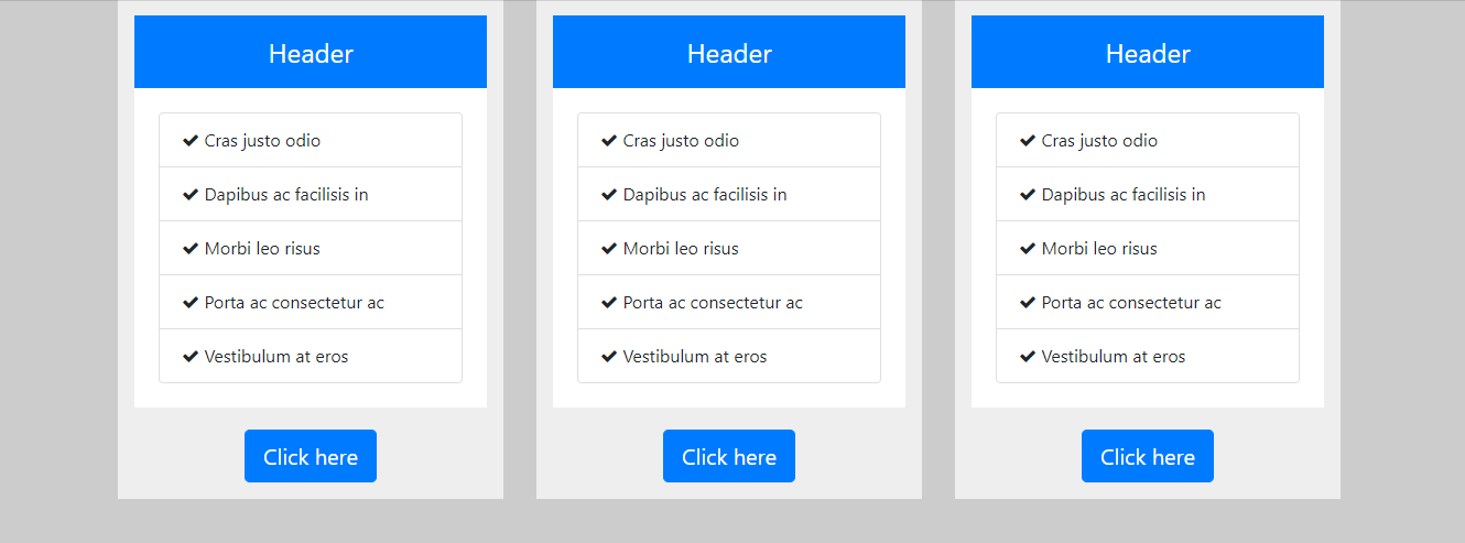
I have created a Cards Layout - 3 cards in a row using Bootstrap 4 / CSS3 (of course its responsive). The following example uses basic Bootstrap 4 classes such as container, row, col-x, list-group and list-group-item. Thought to share here if someone is interested in this sort of a layout.

enter image description here

HTML

<div class="container">
  <div class="row">
    <div class="col-sm-12 col-md-4">
      <div class="custom-column">
        <div class="custom-column-header">Header</div>
        <div class="custom-column-content">
          <ul class="list-group">
            <li class="list-group-item"><i class="fa fa-check"></i> Cras justo odio</li>
            <li class="list-group-item"><i class="fa fa-check"></i> Dapibus ac facilisis in</li>
            <li class="list-group-item"><i class="fa fa-check"></i> Morbi leo risus</li>
            <li class="list-group-item"><i class="fa fa-check"></i> Porta ac consectetur ac</li>
            <li class="list-group-item"><i class="fa fa-check"></i> Vestibulum at eros</li>
          </ul>
        </div>
        <div class="custom-column-footer"><button class="btn btn-primary btn-lg">Click here</button></div>
      </div>
    </div>
    <div class="col-sm-12 col-md-4">
      <div class="custom-column">        
        <div class="custom-column-header">Header</div>
        <div class="custom-column-content">
          <ul class="list-group">
            <li class="list-group-item"><i class="fa fa-check"></i> Cras justo odio</li>
            <li class="list-group-item"><i class="fa fa-check"></i> Dapibus ac facilisis in</li>
            <li class="list-group-item"><i class="fa fa-check"></i> Morbi leo risus</li>
            <li class="list-group-item"><i class="fa fa-check"></i> Porta ac consectetur ac</li>
            <li class="list-group-item"><i class="fa fa-check"></i> Vestibulum at eros</li>
          </ul>
        </div>
        <div class="custom-column-footer"><button class="btn btn-primary btn-lg">Click here</button></div>
      </div>
    </div>
    <div class="col-sm-12 col-md-4">
      <div class="custom-column">
        <div class="custom-column-header">Header</div>
        <div class="custom-column-content">
          <ul class="list-group">
            <li class="list-group-item"><i class="fa fa-check"></i> Cras justo odio</li>
            <li class="list-group-item"><i class="fa fa-check"></i> Dapibus ac facilisis in</li>
            <li class="list-group-item"><i class="fa fa-check"></i> Morbi leo risus</li>
            <li class="list-group-item"><i class="fa fa-check"></i> Porta ac consectetur ac</li>
            <li class="list-group-item"><i class="fa fa-check"></i> Vestibulum at eros</li>
          </ul>
        </div>
        <div class="custom-column-footer"><button class="btn btn-primary btn-lg">Click here</button></div>
      </div>
    </div>
  </div>
</div>

CSS / SCSS

$primary-color: #ccc;
$col-bg-color: #eee;
$col-footer-bg-color: #eee;
$col-header-bg-color: #007bff;
$col-content-bg-color: #fff;

body {
  background-color: $primary-color;
}  

.custom-column {  
  background-color: $col-bg-color;
  border: 5px solid $col-bg-color;    
  padding: 10px;
  box-sizing: border-box;  
}

.custom-column-header {
  font-size: 24px;
  background-color: #007bff;  
  color: white;
  padding: 15px;  
  text-align: center;
}

.custom-column-content {
  background-color: $col-content-bg-color;
  border: 2px solid white;  
  padding: 20px;  
}

.custom-column-footer {
  background-color: $col-footer-bg-color;   
  padding-top: 20px;
  text-align: center;
}

Link :- https://codepen.io/anjanasilva/pen/JmdOpb


Another late answer, but I was playing with this and came up with a general purpose Sass solution that I found useful and many others might as well. To give an overview, this introduces new classes that can modify the column count of a .card-columns element in very similar ways to columns with .col-4 or .col-lg-3:

@import "bootstrap";

$card-column-counts: 1, 2, 3, 4, 5;

.card-columns {
    @each $column-count in $card-column-counts {
        &.card-columns-#{$column-count} {
            column-count: $column-count;
        }
    }

    @each $breakpoint in map-keys($grid-breakpoints) {
        @include media-breakpoint-up($breakpoint) {
            $infix: breakpoint-infix($breakpoint, $grid-breakpoints);
            @each $column-count in $card-column-counts {
                &.card-columns#{$infix}-#{$column-count} {
                    column-count: $column-count;
                }
            }
        }
    }
}

The end result of this is if you have the following:

<div class="card-columns card-columns-2 card-columns-md-3 card-columns-xl-4">
   ...
</div>

Then you would have 2 columns by default, 3 for medium devices and up and 4 for xl devices and up. Additionally if you change your grid breakpoints this will automatically support those, and the $card-column-counts can be overridden to change the allowed numbers of columns.


I realize this question was posted a while ago; nonetheless, Bootstrap v4.0 has card layout support out of the box. You can find the documentation here: Bootstrap Card Layouts.

I've gotten back into using Bootstrap for a recent project that relies heavily on the card layout UI. I've found success with the following implementation across the standard breakpoints:

_x000D_
_x000D_
<link href="https://unpkg.com/[email protected]/css/tachyons.min.css" rel="stylesheet"/>_x000D_
<link href="https://stackpath.bootstrapcdn.com/bootstrap/4.3.1/css/bootstrap.min.css" rel="stylesheet"/>_x000D_
<script src="https://cdnjs.cloudflare.com/ajax/libs/jquery/3.3.1/jquery.min.js"></script>_x000D_
<div class="flex justify-center" id="cars" v-cloak>_x000D_
    <!-- RELEVANT MARKUP BEGINS HERE -->_x000D_
    <div class="container mh0 w-100">_x000D_
        <div class="page-header text-center mb5">_x000D_
            <h1 class="avenir text-primary mb-0">Cars</h1>_x000D_
            <p class="text-secondary">Add and manage your cars for sale.</p>_x000D_
            <div class="header-button">_x000D_
                <button class="btn btn-outline-primary" @click="clickOpenAddCarModalButton">Add a car for sale</button>_x000D_
            </div>_x000D_
        </div>_x000D_
        <div class="container pa0 flex justify-center">_x000D_
            <div class="listings card-columns">_x000D_
                <div class="card mv2">_x000D_
                    <img src="https://farm4.staticflickr.com/3441/3361756632_8d84aa8560.jpg" class="card-img-top"_x000D_
                        alt="Mazda hatchback">_x000D_
                    <div class="card-body">_x000D_
                        <h5 class="card-title">Card title</h5>_x000D_
                        <p class="card-text">Some quick example text to build on the card title and make up the bulk of the card's_x000D_
                            content._x000D_
                        </p>_x000D_
                        <a href="#" class="btn btn-primary">Go somewhere</a>_x000D_
                    </div>_x000D_
                    <div class="card-footer">_x000D_
                        buttons here_x000D_
                    </div>_x000D_
                </div>_x000D_
            </div>_x000D_
        </div>_x000D_
    </div>_x000D_
</div>
_x000D_
_x000D_
_x000D_

After trying both the Bootstrap .card-group and .card-deck card layout classes with quirky results at best across the standard breakpoints, I finally decided to give the .card-columns class a shot. And it worked!

Your results may vary, but .card-columns seems to be the most stable implementation here.


Update 2019 - Bootstrap 4

You can simply use the SASS mixin to change the number of cards across in each breakpoint / grid tier.

.card-columns {
  @include media-breakpoint-only(xl) {
    column-count: 5;
  }
  @include media-breakpoint-only(lg) {
    column-count: 4;
  }
  @include media-breakpoint-only(md) {
    column-count: 3;
  }
  @include media-breakpoint-only(sm) {
    column-count: 2;
  }
}

SASS Demo: http://www.codeply.com/go/FPBCQ7sOjX

Or, CSS only like this...

@media (min-width: 576px) {
    .card-columns {
        column-count: 2;
    }
}

@media (min-width: 768px) {
    .card-columns {
        column-count: 3;
    }
}

@media (min-width: 992px) {
    .card-columns {
        column-count: 4;
    }
}

@media (min-width: 1200px) {
    .card-columns {
        column-count: 5;
    }
}

CSS-only Demo: https://www.codeply.com/go/FIqYTyyWWZ


Examples related to html

Embed ruby within URL : Middleman Blog Please help me convert this script to a simple image slider Generating a list of pages (not posts) without the index file Why there is this "clear" class before footer? Is it possible to change the content HTML5 alert messages? Getting all files in directory with ajax DevTools failed to load SourceMap: Could not load content for chrome-extension How to set width of mat-table column in angular? How to open a link in new tab using angular? ERROR Error: Uncaught (in promise), Cannot match any routes. URL Segment

Examples related to css

need to add a class to an element Using Lato fonts in my css (@font-face) Please help me convert this script to a simple image slider Why there is this "clear" class before footer? How to set width of mat-table column in angular? Center content vertically on Vuetify bootstrap 4 file input doesn't show the file name Bootstrap 4: responsive sidebar menu to top navbar Stylesheet not loaded because of MIME-type Force flex item to span full row width

Examples related to twitter-bootstrap

Bootstrap 4: responsive sidebar menu to top navbar CSS class for pointer cursor How to install popper.js with Bootstrap 4? Change arrow colors in Bootstraps carousel Search input with an icon Bootstrap 4 bootstrap 4 responsive utilities visible / hidden xs sm lg not working bootstrap.min.js:6 Uncaught Error: Bootstrap dropdown require Popper.js Bootstrap 4 - Inline List? Bootstrap 4, how to make a col have a height of 100%? Bootstrap 4: Multilevel Dropdown Inside Navigation

Examples related to bootstrap-4

Bootstrap 4 multiselect dropdown react button onClick redirect page bootstrap 4 file input doesn't show the file name How to use Bootstrap 4 in ASP.NET Core Bootstrap 4: responsive sidebar menu to top navbar CSS class for pointer cursor Change arrow colors in Bootstraps carousel Bootstrap 4 Dropdown Menu not working? Search input with an icon Bootstrap 4 How to import popper.js?