Old question but now there is a simple solution, compatible with most browsers, which is to use CSS3. I tested in IE, Firefox and Chrome and it works.
input[type="radio"] {
    -ms-transform: scale(1.5); /* IE 9 */
    -webkit-transform: scale(1.5); /* Chrome, Safari, Opera */
    transform: scale(1.5);
}
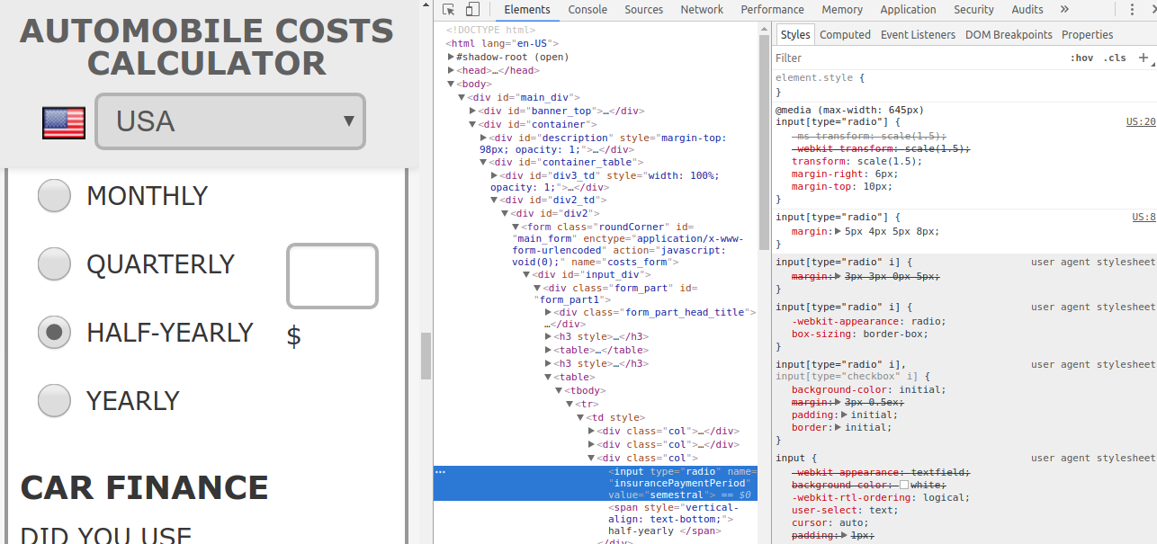
Change the value 1.5, in this case an increment of 50% in size, according to your needs. If the ratio is very high, it can blur the radio button. The next image shows a ratio of 1.5.