Based on Fedor Kazakov and others answers, I created a default config.
styles.xml
<resources>

    <!-- Base application theme. -->
    <style name="AppTheme" parent="Theme.AppCompat.Light">
        <!-- Customize your theme here. -->
        <item name="colorPrimary">@color/colorPrimary</item>
        <item name="colorPrimaryDark">@color/colorPrimaryDark</item>
        <item name="colorAccent">@color/colorAccent</item>
    </style>

    <style name="Widget.Design.TextInputLayout" parent="AppTheme">
        <item name="hintTextAppearance">@style/AppTheme.TextFloatLabelAppearance</item>
        <item name="errorTextAppearance">@style/AppTheme.TextErrorAppearance</item>
        <item name="counterTextAppearance">@style/TextAppearance.Design.Counter</item>
        <item name="counterOverflowTextAppearance">@style/TextAppearance.Design.Counter.Overflow</item>
    </style>

    <style name="AppTheme.TextFloatLabelAppearance" parent="TextAppearance.Design.Hint">
        <!-- Floating label appearance here -->
        <item name="android:textColor">@color/colorAccent</item>
        <item name="android:textSize">20sp</item>
    </style>

    <style name="AppTheme.TextErrorAppearance" parent="TextAppearance.Design.Error">
        <!-- Error message appearance here -->
        <item name="android:textColor">#ff0000</item>
        <item name="android:textSize">20sp</item>
    </style>

</resources>
activity_layout.xml
<android.support.design.widget.TextInputLayout
    android:layout_width="match_parent"
    android:layout_height="wrap_content">

    <android.support.v7.widget.AppCompatEditText
        android:layout_width="match_parent"
        android:layout_height="wrap_content"
        android:hint="Text hint here"
        android:text="5,2" />

</android.support.design.widget.TextInputLayout>
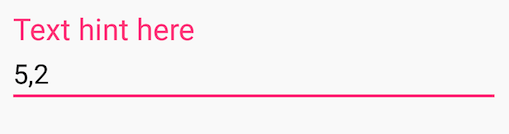
Focused:
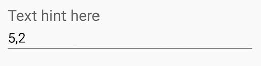
Without focus:
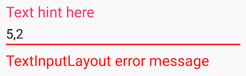
Error message: