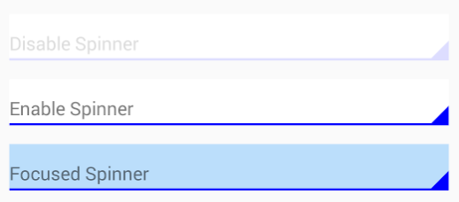
spinner_selector.xml
<?xml version="1.0" encoding="utf-8"?>
<selector xmlns:android="http://schemas.android.com/apk/res/android">
    <item android:drawable="@drawable/spinner_enabled" android:state_enabled="true" android:state_pressed="false" /> <!-- enable -->
    <item android:drawable="@drawable/spinner_clicked" android:state_enabled="true" android:state_pressed="true" />
    <item android:drawable="@drawable/spinner_disabled" android:state_enabled="false" /> <!-- disable -->
</selector>
spinner_enabled.xml
<?xml version="1.0" encoding="utf-8"?>
<layer-list xmlns:android="http://schemas.android.com/apk/res/android">

<item>
    <shape android:shape="rectangle" >
        <solid android:color="#00f" />
        <padding android:bottom="2dp" />
    </shape>
</item>

<item>
    <shape android:shape="rectangle" >
        <solid android:color="#fff" />
    </shape>
</item>

<item>
    <rotate
        android:fromDegrees="90"
        android:pivotX="100%"
        android:pivotY="60%"
        android:toDegrees="135">
        <rotate
            android:fromDegrees="135"
            android:pivotX="100%"
            android:pivotY="60%"
            android:toDegrees="45">
            <shape android:shape="rectangle">
                <stroke
                    android:width="10dp"
                    android:color="#00f" />
                <solid android:color="#00f" />
            </shape>
        </rotate>
    </rotate>
</item>
</layer-list>
spinner_disabled.xml
<?xml version="1.0" encoding="utf-8"?>
<layer-list xmlns:android="http://schemas.android.com/apk/res/android">

<item>
    <shape android:shape="rectangle" >
        <solid android:color="#ddf" />
        <padding android:bottom="2dp" />
    </shape>
</item>

<item>
    <shape android:shape="rectangle" >
        <solid android:color="#fff" />
    </shape>
</item>

<item>
    <rotate
        android:fromDegrees="90"
        android:pivotX="100%"
        android:pivotY="60%"
        android:toDegrees="135">
        <rotate
            android:fromDegrees="135"
            android:pivotX="100%"
            android:pivotY="60%"
            android:toDegrees="45">
            <shape android:shape="rectangle">
                <stroke
                    android:width="10dp"
                    android:color="#ddf" />
                <solid android:color="#ddf" />
            </shape>
        </rotate>
    </rotate>
</item>
</layer-list>
spinner_focused.xml
<?xml version="1.0" encoding="utf-8"?>
<layer-list xmlns:android="http://schemas.android.com/apk/res/android">

<item>
    <shape android:shape="rectangle" >
        <solid android:color="#00f" />
        <padding android:bottom="2dp" />
    </shape>
</item>

<item>
    <shape android:shape="rectangle" >
        <solid android:color="#BBDEFB" />
    </shape>
</item>

<item>
    <rotate
        android:fromDegrees="90"
        android:pivotX="100%"
        android:pivotY="60%"
        android:toDegrees="135">
        <rotate
            android:fromDegrees="135"
            android:pivotX="100%"
            android:pivotY="60%"
            android:toDegrees="45">
            <shape android:shape="rectangle">
                <stroke
                    android:width="10dp"
                    android:color="#00f" />
                <solid android:color="#00f" />
            </shape>
        </rotate>
    </rotate>
</item>
</layer-list>
it works fine without nine-patch pictures.
api 10+