I want a color overlay on this header element. How can I do this with CSS?
#header {
/* Original url */
/*background: url(../img/bg.jpg) 0 0 no-repeat fixed;*/
background: url(https://fakeimg.pl/250x100/) 0 0 no-repeat fixed;
height: 100%;
overflow: hidden;
color: #FFFFFF
}
_x000D_
<header id="header">
<div class="row">
<div class="col-xs-12">
...
</div>
</div>
</header>
_x000D_
If you don't mind using absolute positioning, you can position your background image, and then add an overlay using opacity.
div {
width:50px;
height:50px;
background: url('http://images1.wikia.nocookie.net/__cb20120626155442/adventuretimewithfinnandjake/images/6/67/Link.gif');
position:absolute;
left:0;
top:0;
}
.overlay {
background:red;
opacity:.5;
}
See here: http://jsfiddle.net/4yh9L/
Use mutple backgorund on the element, and use a linear-gradient as your color overlay by declaring both start and end color-stops as the same value.
Note that layers in a multi-background declaration are read much like they are rendered, top-to-bottom, so put your overlay first, then your bg image:
#header {
background:
linear-gradient(to bottom, rgba(100, 100, 0, 0.5), rgba(100, 100, 0, 0.5)) cover,
url(../img/bg.jpg) 0 0 no-repeat fixed;
height: 100%;
overflow: hidden;
color: #FFFFFF
}
You can also add an additional class with such settings. Overlay will not overlap content and no additional tag is needed
.overlay {
position: relative;
z-index: 0;
}
.overlay::after {
content: '';
position: absolute;
top: 0;
left: 0;
width: 100%;
height: 100%;
background: red;
opacity: .6;
/* !!! */
z-index: -1;
}
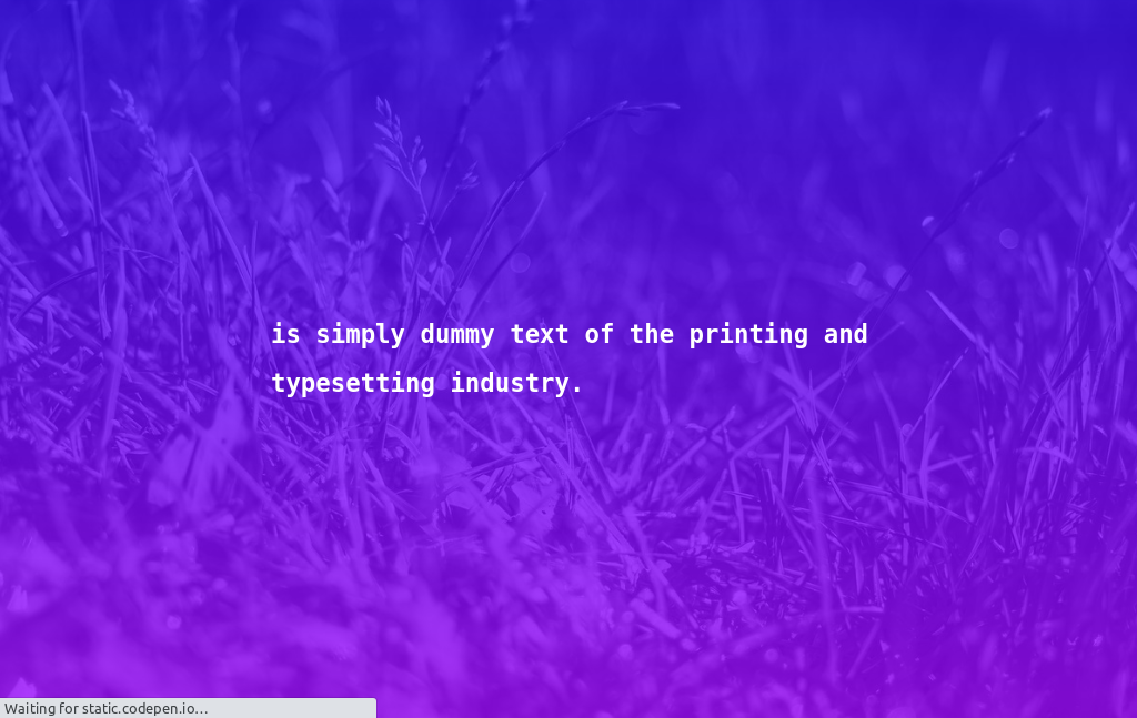
You can do that in one line of CSS.
background: linear-gradient(to right, #3204fdba, #9907facc), url(https://picsum.photos/1280/853/?random=1) no-repeat top center;
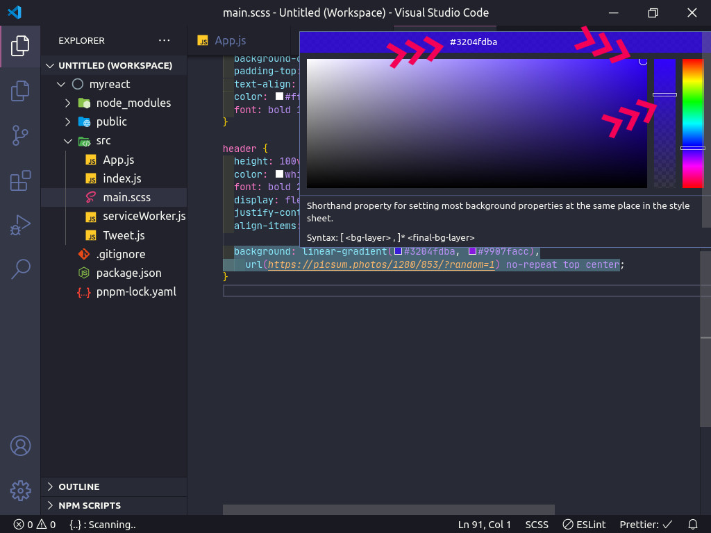
Also hover on the color in VS Code, and click on the color to be a hex color, and you can change the colors opacity easy, instead of the rgba (rgba(48, 3, 252, 0.902), rgba(153, 7, 250, 0.902))
, It can be short to
(#3204fde6, #9907fae6)
header{
height: 100vh;
color: white;
font: bold 2em/2em monospace;
display: flex;
justify-content: center;
align-items: center;
background: linear-gradient(to right,#3204fdba, #9907facc), url(https://picsum.photos/1280/853/?random=1) no-repeat top center;
}
_x000D_
<header>is simply dummy text of the printing and<br> typesetting industry.</header>
_x000D_
See here CodePen
You may use negative superthick semi-transparent border...
.red {_x000D_
outline: 100px solid rgba(255, 0, 0, 0.5) !important;_x000D_
outline-offset: -100px;_x000D_
overflow: hidden;_x000D_
position: relative;_x000D_
height: 200px;_x000D_
width: 200px;_x000D_
}
_x000D_
<div class="red">Anything can be red.</div>_x000D_
<h1>Or even image...</h1>_x000D_
<img src="https://cdn.sstatic.net/Sites/stackoverflow/company/img/logos/so/so-logo.png?v=9c558ec15d8a" class="red"/>
_x000D_
This solution requires you to know exact sizes of covered object.
If you want to just add a class to add the overlay:
span {_x000D_
padding: 5px;_x000D_
}_x000D_
_x000D_
.green {_x000D_
background-color: green;_x000D_
color: #FFF;_x000D_
}_x000D_
_x000D_
.overlayed {_x000D_
position: relative;_x000D_
}_x000D_
_x000D_
.overlayed::before {_x000D_
content: ' ';_x000D_
z-index: 1;_x000D_
position: absolute;_x000D_
top: 0;_x000D_
bottom: 0;_x000D_
left: 0;_x000D_
right: 0;_x000D_
background-color: #00000080;_x000D_
}_x000D_
_x000D_
.stand-out {_x000D_
position: relative;_x000D_
z-index: 2;_x000D_
}
_x000D_
<span class="green overlayed">with overlay</span>_x000D_
<span class="green">without overlay</span>_x000D_
<br>_x000D_
<br>_x000D_
<span class="green overlayed">_x000D_
<span class="stand-out">I stand out</span>_x000D_
</span>
_x000D_
Important: the element you put the overlayed
class on needs to have a position
set. If it doesn't, the ::before
element will take the size of some other parent element. In my example I've set the position to "relative" via the .overlayed
rule, but in your use case you might need "absolute" or some other value.
Also, make sure that the z-index
of the overlayed
class is higher than the ones of the eventual child elements of the container, unless you actually want for those to "stand out" and not be overlayed (as with the span with the stand-out
class, in my snippet).
Here's a creative idea using box-shadow
:
#header {
background-image: url("apple.jpg");
box-shadow: inset 0 0 99999px rgba(0, 120, 255, 0.5);
}
The background
sets the background for your element.
The box-shadow
is the important bit. It basically sets a really big shadow on the inside of the element, on top of the background, that is semi-transparent
In helpshift, they used the class home-page
as
<div class="page home-page">...</div>
.home-page {
background: transparent url("../images/backgrounds/image-overlay.png") repeat 0 0;
background: rgba(39,62,84,0.82);
overflow: hidden;
height: 100%;
z-index: 2;
}
you can try similar like this
You could use the hue-rotate
function in the filter
property. It's quite an obscure measurement though, you'd need to know how many degrees round the colour wheel you need to move in order to arrive at your desired hue, for example:
header {
filter: hue-rotate(90deg);
}
Once you'd found the correct hue, you could combine the brightness
and either grayscale
or saturate
functions to find the correct shade, for example:
header {
filter: hue-rotate(90deg) brightness(10%) grayscale(10%);
}
The filter
property has a vendor prefix in Webkit, so the final code would be:
header {
-webkit-filter: hue-rotate(90deg) brightness(10%) grayscale(10%);
filter: hue-rotate(90deg) brightness(10%) grayscale(10%);
}
#header.overlay {
background-color: SlateGray;
position:relative;
width: 100%;
height: 100%;
opacity: 0.20;
-moz-opacity: 20%;
-webkit-opacity: 20%;
z-index: 2;
}
Something like this. Just add the overlay
class to the header, obviously.
Source: Stackoverflow.com