Bootstrap tabs are not responsive out of the box. Responsive, IMO, is a style change, changing functions is Adaptive. There are a few plugins to turn the Bootstrap 3 tabs into a Collapse component. The best and most updated one is : https://github.com/flatlogic/bootstrap-tabcollapse.
Here's one way of implementing it:
DEMO: http://jsbin.com/zibani/1/
EDIT: http://jsbin.com/zibani/1/edit
This turns the content into a collapse component:
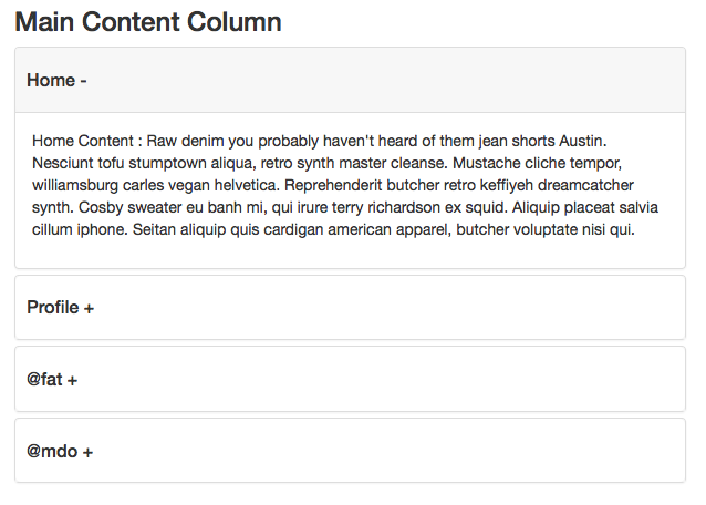
Dependencies:
- Bootstrap 3.2 css or higher but still in the 3 series
- Bootstrap 3.2 jQuery or higher but still in the 3 series
- Compatible version of bootstrap-tabcollapse.js
HTML -- same as question with class name addition:
<ul class="nav nav-tabs content-tabs" id="maincontent" role="tablist">
jQuery:
$(document).ready(function() {

    // DEPENDENCY: https://github.com/flatlogic/bootstrap-tabcollapse
    $('.content-tabs').tabCollapse();

    // initialize tab function
    $('.nav-tabs a').click(function(e) {
        e.preventDefault();
        $(this).tab('show');
    });

});
CSS -- optional for fat fingers and active states:
.panel-heading {
    padding: 0
}
.panel-heading a {
    display: block;
    padding: 20px 10px;
}
.panel-heading a.collapsed {
    background: #fff
}
.panel-heading a {
    background: #f7f7f7;
    border-radius: 5px;
}
.panel-heading a:after {
    content: '-'
}
.panel-heading a.collapsed:after {
    content: '+'
}
.nav.nav-tabs li a,
.nav.nav-tabs li.active > a:hover,
.nav.nav-tabs li.active > a:active,
.nav.nav-tabs li.active > a:focus {
    border-bottom-width: 0px;
    outline: none;
}
.nav.nav-tabs li a {
    padding-top: 20px;
    padding-bottom: 20px;
}
.tab-pane {
    background: #fff;
    padding: 10px;
    border: 1px solid #ddd;
    margin-top: -1px;
}