[html] Div with horizontal scrolling only

I have a fixed width DIV containing a table with many columns, and need to allow the user to scroll the table horizontally within the DIV.

This needs to work on IE6 and IE7 only (internal client application).

The following works in IE7:

overflow-x: scroll;

Can anyone help with a solution that works in IE6 as well?

This question is related to html css

The answer is


The solution is fairly straight forward. To ensure that we don't impact the width of the cells in the table, we'll turn off white-space. To ensure we get a horizontal scroll bar, we'll turn on overflow-x. And that's pretty much it:

.container {
    width: 30em;
    overflow-x: auto;
    white-space: nowrap;
}

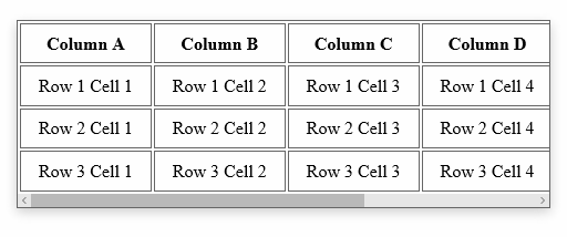
You can see the end-result here, or in the animation below. If the table determines the height of your container, you should not need to explicitly set overflow-y to hidden. But understand that is also an option.

enter image description here


overflow-x: scroll;
overflow-y: hidden;

EDIT:

It works for me:

<div style='overflow-x:scroll;overflow-y:hidden;width:250px;height:200px'>
    <div style='width:400px;height:250px'></div>
</div>

For horizontal scroll, keep these two properties in mind:

overflow-x:scroll;
white-space: nowrap;

See working link : click me

HTML

<p>overflow:scroll</p>
<div class="scroll">You can use the overflow property when you want to have better   control of the layout. The default value is visible.You can use the overflow property when you want     to have better control of the layout. The default value is visible.</div>

CSS

div.scroll
{
background-color:#00FFFF;
height:40px;
overflow-x:scroll;
white-space: nowrap;
}

overflow-x: scroll;
overflow-y: hidden;

EDIT:

It works for me:

<div style='overflow-x:scroll;overflow-y:hidden;width:250px;height:200px'>
    <div style='width:400px;height:250px'></div>
</div>

try this:

HTML:

<div class="container">
  <div class="item">1</div>
  <div class="item">2</div>
  <div class="item">3</div>
  <div class="item">4</div>
  <div class="item">5</div>
</div>

CSS:

.container {
  width: 200px;
  height: 100px;
  display: flex;
  overflow-x: auto;
}

.item {
  width: 100px;
  flex-shrink: 0;
  height: 100px;
}

The white-space: nowrap; property dont let you wrap text. Just see here for an example: https://codepen.io/oezkany/pen/YoVgYK


For horizontal scroll, keep these two properties in mind:

overflow-x:scroll;
white-space: nowrap;

See working link : click me

HTML

<p>overflow:scroll</p>
<div class="scroll">You can use the overflow property when you want to have better   control of the layout. The default value is visible.You can use the overflow property when you want     to have better control of the layout. The default value is visible.</div>

CSS

div.scroll
{
background-color:#00FFFF;
height:40px;
overflow-x:scroll;
white-space: nowrap;
}

I couldn't get the selected answer to work but after a bit of research, I found that the horizontal scrolling div must have white-space: nowrap in the css.

Here's complete working code:

<!doctype html>
<html lang="en">
<head>
    <meta charset="utf-8">
    <title>Something</title>
    <style type="text/css">
        #scrolly{
            width: 1000px;
            height: 190px;
            overflow: auto;
            overflow-y: hidden;
            margin: 0 auto;
            white-space: nowrap
        }

        img{
            width: 300px;
            height: 150px;
            margin: 20px 10px;
            display: inline;
        }
    </style>
</head>
<body>
    <div id='scrolly'>
        <img src='img/car.jpg'></img>
        <img src='img/car.jpg'></img>
        <img src='img/car.jpg'></img>
        <img src='img/car.jpg'></img>
        <img src='img/car.jpg'></img>
        <img src='img/car.jpg'></img>
    </div>
</body>
</html>

try this:

HTML:

<div class="container">
  <div class="item">1</div>
  <div class="item">2</div>
  <div class="item">3</div>
  <div class="item">4</div>
  <div class="item">5</div>
</div>

CSS:

.container {
  width: 200px;
  height: 100px;
  display: flex;
  overflow-x: auto;
}

.item {
  width: 100px;
  flex-shrink: 0;
  height: 100px;
}

The white-space: nowrap; property dont let you wrap text. Just see here for an example: https://codepen.io/oezkany/pen/YoVgYK


I couldn't get the selected answer to work but after a bit of research, I found that the horizontal scrolling div must have white-space: nowrap in the css.

Here's complete working code:

<!doctype html>
<html lang="en">
<head>
    <meta charset="utf-8">
    <title>Something</title>
    <style type="text/css">
        #scrolly{
            width: 1000px;
            height: 190px;
            overflow: auto;
            overflow-y: hidden;
            margin: 0 auto;
            white-space: nowrap
        }

        img{
            width: 300px;
            height: 150px;
            margin: 20px 10px;
            display: inline;
        }
    </style>
</head>
<body>
    <div id='scrolly'>
        <img src='img/car.jpg'></img>
        <img src='img/car.jpg'></img>
        <img src='img/car.jpg'></img>
        <img src='img/car.jpg'></img>
        <img src='img/car.jpg'></img>
        <img src='img/car.jpg'></img>
    </div>
</body>
</html>

overflow-x: scroll;
overflow-y: hidden;

EDIT:

It works for me:

<div style='overflow-x:scroll;overflow-y:hidden;width:250px;height:200px'>
    <div style='width:400px;height:250px'></div>
</div>