[jquery] Build Step Progress Bar (css and jquery)

enter image description here

You've seen iterations of this type of progress bar on sites like paypal. How does one go about setting this up using CSS and jquery? I have 4 pages and each page is a step... so 4 steps.

This question is related to jquery css progress-bar multi-step

The answer is


This is how I have achieved it using purely CSS and HTML (no JavaScript/images etc.).

http://jsfiddle.net/tuPrn/

It gracefully degrades in most browsers (I do need to add in a fix for lack of last-of-type in < IE9).


There are a lot of very nice answers on this page and I googled for some more, but none of the answers ticked all the checkboxes on my wish list:

  • CSS only, no Javascript
  • Stick to Tom Kenny's Best Design Practices
  • Layout like the other answers
  • Each step has a name and a number
  • Responsive layout: font size independent
  • Fluid layout: the list and its items scale with the available width
  • The names and numbers are centered in their block
  • The "done" color goes up to and including the active item, but not past it.
  • The active item should stand out graphically

So I mixed the code of several examples, fixed the things that I needed and here is the result:

Progress Tracker v2

I used the following CSS and HTML:

_x000D_
_x000D_
/* Progress Tracker v2 */_x000D_
ol.progress[data-steps="2"] li { width: 49%; }_x000D_
ol.progress[data-steps="3"] li { width: 33%; }_x000D_
ol.progress[data-steps="4"] li { width: 24%; }_x000D_
ol.progress[data-steps="5"] li { width: 19%; }_x000D_
ol.progress[data-steps="6"] li { width: 16%; }_x000D_
ol.progress[data-steps="7"] li { width: 14%; }_x000D_
ol.progress[data-steps="8"] li { width: 12%; }_x000D_
ol.progress[data-steps="9"] li { width: 11%; }_x000D_
_x000D_
.progress {_x000D_
    width: 100%;_x000D_
    list-style: none;_x000D_
    list-style-image: none;_x000D_
    margin: 20px 0 20px 0;_x000D_
    padding: 0;_x000D_
}_x000D_
_x000D_
.progress li {_x000D_
    float: left;_x000D_
    text-align: center;_x000D_
    position: relative;_x000D_
}_x000D_
_x000D_
.progress .name {_x000D_
    display: block;_x000D_
    vertical-align: bottom;_x000D_
    text-align: center;_x000D_
    margin-bottom: 1em;_x000D_
    color: black;_x000D_
    opacity: 0.3;_x000D_
}_x000D_
_x000D_
.progress .step {_x000D_
    color: black;_x000D_
    border: 3px solid silver;_x000D_
    background-color: silver;_x000D_
    border-radius: 50%;_x000D_
    line-height: 1.2;_x000D_
    width: 1.2em;_x000D_
    height: 1.2em;_x000D_
    display: inline-block;_x000D_
    z-index: 0;_x000D_
}_x000D_
_x000D_
.progress .step span {_x000D_
    opacity: 0.3;_x000D_
}_x000D_
_x000D_
.progress .active .name,_x000D_
.progress .active .step span {_x000D_
    opacity: 1;_x000D_
}_x000D_
_x000D_
.progress .step:before {_x000D_
    content: "";_x000D_
    display: block;_x000D_
    background-color: silver;_x000D_
    height: 0.4em;_x000D_
    width: 50%;_x000D_
    position: absolute;_x000D_
    bottom: 0.6em;_x000D_
    left: 0;_x000D_
    z-index: -1;_x000D_
}_x000D_
_x000D_
.progress .step:after {_x000D_
    content: "";_x000D_
    display: block;_x000D_
    background-color: silver;_x000D_
    height: 0.4em;_x000D_
    width: 50%;_x000D_
    position: absolute;_x000D_
    bottom: 0.6em;_x000D_
    right: 0;_x000D_
    z-index: -1;_x000D_
}_x000D_
_x000D_
.progress li:first-of-type .step:before {_x000D_
    display: none;_x000D_
}_x000D_
_x000D_
.progress li:last-of-type .step:after {_x000D_
    display: none;_x000D_
}_x000D_
_x000D_
.progress .done .step,_x000D_
.progress .done .step:before,_x000D_
.progress .done .step:after,_x000D_
.progress .active .step,_x000D_
.progress .active .step:before {_x000D_
    background-color: yellowgreen;_x000D_
}_x000D_
_x000D_
.progress .done .step,_x000D_
.progress .active .step {_x000D_
    border: 3px solid yellowgreen;_x000D_
}
_x000D_
<!-- Progress Tracker v2 -->_x000D_
<ol class="progress" data-steps="4">_x000D_
    <li class="done">_x000D_
        <span class="name">Foo</span>_x000D_
        <span class="step"><span>1</span></span>_x000D_
    </li>_x000D_
    <li class="done">_x000D_
        <span class="name">Bar</span>_x000D_
        <span class="step"><span>2</span></span>_x000D_
    </li>_x000D_
    <li class="active">_x000D_
        <span class="name">Baz</span>_x000D_
        <span class="step"><span>3</span></span>_x000D_
    </li>_x000D_
    <li>_x000D_
        <span class="name">Quux</span>_x000D_
        <span class="step"><span>4</span></span>_x000D_
    </li>_x000D_
</ol>
_x000D_
_x000D_
_x000D_

As can be seen in the example above, there are now two list item classes to take note of: active and done. Use class="active" for the current step, use class="done" for all steps before it.

Also note the data-steps="4" in the ol tag; set this to the total number of steps to apply the correct size to all list items.

Feel free to play around with the JSFiddle. Enjoy!


What I would do is use the same trick often use for hovering on buttons. Prepare an image that has 2 parts: (1) a top half which is greyed out, meaning incomplete, and (2) a bottom half which is colored in, meaning completed. Use the same image 4 times to make up the 4 steps of the progress bar, and align top for incomplete steps, and align bottom for incomplete steps.

In order to take advantage of image alignment, you'd have to use the image as the background for 4 divs, rather than using the img element.

This is the CSS for background image alignment:

div.progress-incomplete {
  background-position: top;
}
div.progress-finished {
  background-position: bottom;
}

I had the same requirements to create a kind of step progress tracker so I created a JavaScript plugin for that purpose. Here is the JsFiddle for the demo for this step progress tracker. You can access its code on GitHub as well.

What it basically does is, it takes the json data(in a particular format described below) as input and creates the progress tracker based on that. Highlighted steps indicates the completed steps.

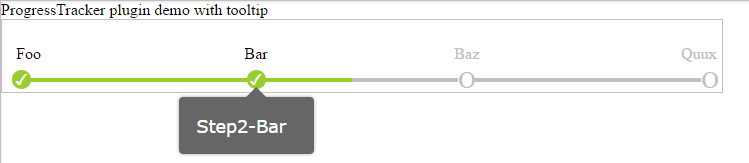
It's html will somewhat look like shown below with default CSS but you can customize it as per the theme of your application. There is an option to show tool-tip text for each steps as well.

Here is some code snippet for that:

//container div 
<div id="tracker1" style="width: 700px">
</div>

//sample JSON data
var sampleJson1 = {
ToolTipPosition: "bottom",
data: [{ order: 1, Text: "Foo", ToolTipText: "Step1-Foo", highlighted: true },
    { order: 2, Text: "Bar", ToolTipText: "Step2-Bar", highlighted: true },
    { order: 3, Text: "Baz", ToolTipText: "Step3-Baz", highlighted: false },
    { order: 4, Text: "Quux", ToolTipText: "Step4-Quux", highlighted: false }]
};    

//Invoking the plugin
$(document).ready(function () {
        $("#tracker1").progressTracker(sampleJson1);
    });

Hopefully it will be useful for somebody else as well!

enter image description here


This is what I did:

  1. Create jQuery .progressbar() to load a div into a progress bar.
  2. Create the step title on the bottom of the progress bar. Position them with CSS.
  3. Then I create function in jQuery that change the value of the progressbar everytime user move on to next step.

HTML

<div id="divProgress"></div>
<div id="divStepTitle">
    <span class="spanStep">Step 1</span> <span class="spanStep">Step 2</span> <span class="spanStep">Step 3</span>
</div>

<input type="button" id="btnPrev" name="btnPrev" value="Prev" />
<input type="button" id="btnNext" name="btnNext" value="Next" />

CSS

#divProgress
{
    width: 600px;
}

#divStepTitle
{
    width: 600px;
}

.spanStep
{
    text-align: center;
    width: 200px;
}

Javascript/jQuery

var progress = 0;

$(function({
    //set step progress bar
    $("#divProgress").progressbar();

    //event handler for prev and next button
    $("#btnPrev, #btnNext").click(function(){
        step($(this));
    });
});

function step(obj)
{
    //switch to prev/next page
    if (obj.val() == "Prev")
    {
        //set new value for progress bar
        progress -= 20;
        $("#divProgress").progressbar({ value: progress });

        //do extra step for showing previous page
    }
    else if (obj.val() == "Next")
    {
        //set new value for progress bar
        progress += 20;
        $("#divProgress").progressbar({ value: progress });

        //do extra step for showing next page
    }
}


I have searched for a solution that will visualize process steps in my web application. I have found the following excellent write-up by Stephen A Thomas:

Tracking Progress in Pure CSS (Original Link now dead)

In his approach Thomas even gets away with just using CSS - no Javascript! In an essence the following CSS code from his article does the trick for me:

    <style>

    <!-- Progress with steps -->

    ol.progtrckr {
        margin: 0;
        padding: 0;
        list-style-type: none;
    }

    ol.progtrckr li {
        display: inline-block;
        text-align: center;
        line-height: 3em;
    }

    ol.progtrckr[data-progtrckr-steps="2"] li { width: 49%; }
    ol.progtrckr[data-progtrckr-steps="3"] li { width: 33%; }
    ol.progtrckr[data-progtrckr-steps="4"] li { width: 24%; }
    ol.progtrckr[data-progtrckr-steps="5"] li { width: 19%; }
    ol.progtrckr[data-progtrckr-steps="6"] li { width: 16%; }
    ol.progtrckr[data-progtrckr-steps="7"] li { width: 14%; }
    ol.progtrckr[data-progtrckr-steps="8"] li { width: 12%; }
    ol.progtrckr[data-progtrckr-steps="9"] li { width: 11%; }

    ol.progtrckr li.progtrckr-done {
        color: black;
        border-bottom: 4px solid yellowgreen;
    }
    ol.progtrckr li.progtrckr-todo {
        color: silver; 
        border-bottom: 4px solid silver;
    }

    ol.progtrckr li:after {
        content: "\00a0\00a0";
    }
    ol.progtrckr li:before {
        position: relative;
        bottom: -2.5em;
        float: left;
        left: 50%;
        line-height: 1em;
    }
    ol.progtrckr li.progtrckr-done:before {
        content: "\2713";
        color: white;
        background-color: yellowgreen;
        height: 1.2em;
        width: 1.2em;
        line-height: 1.2em;
        border: none;
        border-radius: 1.2em;
    }
    ol.progtrckr li.progtrckr-todo:before {
        content: "\039F";
        color: silver;
        background-color: white;
        font-size: 1.5em;
        bottom: -1.6em;
    }

</style>

As well as HTML tags from his example (I use Grails GSP pages to generate tags and 'done/todo' class dynamically):

<ol class="progtrckr" data-progtrckr-steps="5">
    <li class="progtrckr-done">Order Processing</li>
    <li class="progtrckr-done">Pre-Production</li>
    <li class="progtrckr-done">In Production</li>
    <li class="progtrckr-done">Shipped</li>
    <li class="progtrckr-todo">Delivered</li>
</ol>

Hope it helps. Works pretty well for me.


UPDATE: The following (shortened) version also works well.

    ol.progtrckr {
        display: table;
        list-style-type: none;
        margin: 0;
        padding: 0;
        table-layout: fixed;
        width: 100%;
    }
    ol.progtrckr li {
        display: table-cell;
        text-align: center;
        line-height: 3em;
    }
    ... and the rest of the CSS ...

    <ol class="progtrckr">
        ...
    </ol>

display: table; table-layout: fixed; width: 100% ensure that the list items are automatically sized equally as long as the content does not overflow. There is no need to use data-progtrckr-steps and its associated CSS.


Examples related to jquery

How to make a variable accessible outside a function? Jquery assiging class to th in a table Please help me convert this script to a simple image slider Highlight Anchor Links when user manually scrolls? Getting all files in directory with ajax Bootstrap 4 multiselect dropdown Cross-Origin Read Blocking (CORB) bootstrap 4 file input doesn't show the file name Jquery AJAX: No 'Access-Control-Allow-Origin' header is present on the requested resource how to remove json object key and value.?

Examples related to css

need to add a class to an element Using Lato fonts in my css (@font-face) Please help me convert this script to a simple image slider Why there is this "clear" class before footer? How to set width of mat-table column in angular? Center content vertically on Vuetify bootstrap 4 file input doesn't show the file name Bootstrap 4: responsive sidebar menu to top navbar Stylesheet not loaded because of MIME-type Force flex item to span full row width

Examples related to progress-bar

How to Create a circular progressbar in Android which rotates on it? Dynamically change bootstrap progress bar value when checkboxes checked Tkinter: How to use threads to preventing main event loop from "freezing" File upload progress bar with jQuery CSS Progress Circle How to set the Android progressbar's height? How to use WinForms progress bar? Display a loading bar before the entire page is loaded Progress Bar with HTML and CSS How to change color in circular progress bar?

Examples related to multi-step

Build Step Progress Bar (css and jquery)