[css] Any way to limit border length?

Is there any way to limit the length of a border. I have a <div> that has a bottom border, but I want to add a border on the left of the <div> that only stretches half of the way up.

Is there any way to do so without adding extra elements on the page?

This question is related to css

The answer is


This is a CSS trick, not a formal solution. I leave the code with the period black because it helps me position the element. Afterward, color your content (color:white) and (margin-top:-5px or so) to make it as though the period is not there.

div.yourdivname:after {
content: ".";
  border-bottom:1px solid grey;
  width:60%;
  display:block;
  margin:0 auto;
}

Another way of doing this is using border-image in combination with a linear-gradient.

_x000D_
_x000D_
div {_x000D_
  width: 100px;_x000D_
  height: 75px;_x000D_
  background-color: green;_x000D_
  background-clip: content-box; /* so that the background color is not below the border */_x000D_
  _x000D_
  border-left: 5px solid black;_x000D_
  border-image: linear-gradient(to top, #000 50%, rgba(0,0,0,0) 50%); /* to top - at 50% transparent */_x000D_
  border-image-slice: 1;_x000D_
}
_x000D_
<div></div>
_x000D_
_x000D_
_x000D_

jsfiddle: https://jsfiddle.net/u7zq0amc/1/


Browser Support: IE: 11+

Chrome: all

Firefox: 15+

For a better support also add vendor prefixes.

caniuse border-image


CSS generated content can solve this for you:

_x000D_
_x000D_
div {_x000D_
  position: relative;_x000D_
}_x000D_
_x000D_
_x000D_
/* Main div for border to extend to 50% from bottom left corner */_x000D_
_x000D_
div:after {_x000D_
  content: "";_x000D_
  background: black;_x000D_
  position: absolute;_x000D_
  bottom: 0;_x000D_
  left: 0;_x000D_
  height: 50%;_x000D_
  width: 1px;_x000D_
}
_x000D_
<div>Lorem Ipsum</div>
_x000D_
_x000D_
_x000D_

(note - the content: ""; declaration is necessary in order for the pseudo-element to render)


You can define one border per side only. You would have to add an extra element for that!


The ::after pseudo-element rocks :)

If you play a bit you can even set your resized border element to appear centered or to appear only if there is another element next to it (like in menus). Here is an example with a menu:

#menu > ul > li {
    position: relative;
    float: left;
    padding: 0 10px;
}

#menu > ul > li + li::after {
    content:"";
    background: #ccc;
    position: absolute;
    bottom: 25%;
    left: 0;
    height: 50%;
    width: 1px;
}

_x000D_
_x000D_
#menu > ul > li {
  position: relative;
  float: left;
  padding: 0 10px;
  list-style: none;
}
#menu > ul > li + li::after {
  content: "";
  background: #ccc;
  position: absolute;
  bottom: 25%;
  left: 0;
  height: 50%;
  width: 1px;
}
_x000D_
<div id="menu">
  <ul>
    <li>Foo</li>
    <li>Bar</li>
    <li>Baz</li>
  </ul>
</div>
_x000D_
_x000D_
_x000D_


for horizontal lines you can use hr tag:

hr { width: 90%; }

but its not possible to limit border height. only element height.


Borders are defined per side only, not in fractions of a side. So, no, you can't do that.

Also, a new element wouldn't be a border either, it would only mimic the behaviour you want - but it would still be an element.


Another solution is you could use a background image to mimic the look of a left border

  1. Create the border-left style you require as a graphic
  2. Position it to the very left of your div (make it long enough to handle roughly two text size increases for older browsers)
  3. Set the vertical position 50% from the top of your div.

You might need to tweak for IE (as per usual) but it's worth a shot if that's the design you are going for.

  • I am generally against using images for something that CSS inherently provides, but sometimes if the design needs it, there's no other way round it.

With CSS properties, we can only control the thickness of border; not length.

However we can mimic border effect and control its width and height as we want with some other ways.

With CSS (Linear Gradient):

We can use linear-gradient() to create a background image(s) and control its size and position with CSS so that it looks like a border. As we can apply multiple background images to an element, we can use this feature to create multiple border like images and apply on different sides of element. We can also cover the remaining available area with some solid color, gradient or background image.

Required HTML:

All we need is one element only (possibly having some class).

<div class="box"></div>

Steps:

  1. Create background image(s) with linear-gradient().
  2. Use background-size to adjust the width / height of above created image(s) so that it looks like a border.
  3. Use background-position to adjust position (like left, right, left bottom etc.) of the above created border(s).

Necessary CSS:

.box {
  background-image: linear-gradient(purple, purple),
                    // Above css will create background image that looks like a border.
                    linear-gradient(steelblue, steelblue);
                    // This will create background image for the container.

  background-repeat: no-repeat;

  /* First sizing pair (4px 50%) will define the size of the border i.e border
     will be of having 4px width and 50% height. */
  /* 2nd pair will define the size of stretched background image. */
  background-size: 4px 50%, calc(100% - 4px) 100%;

  /* Similar to size, first pair will define the position of the border
     and 2nd one for the container background */
  background-position: left bottom, 4px 0;
}

Examples:

With linear-gradient() we can create borders of solid color as well as having gradients. Below are some examples of border created with this method.

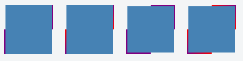
Example with border applied on one side only:

_x000D_
_x000D_
.container {_x000D_
  display: flex;_x000D_
}_x000D_
.box {_x000D_
  background-image: linear-gradient(purple, purple),_x000D_
                    linear-gradient(steelblue, steelblue);_x000D_
  background-repeat: no-repeat;_x000D_
  background-size: 4px 50%, calc(100% - 4px) 100%;_x000D_
  background-position: left bottom, 4px 0;_x000D_
_x000D_
  height: 160px;_x000D_
  width: 160px;_x000D_
  margin: 20px;_x000D_
}_x000D_
.gradient-border {_x000D_
  background-image: linear-gradient(red, purple),_x000D_
                    linear-gradient(steelblue, steelblue);_x000D_
}
_x000D_
<div class="container">_x000D_
  <div class="box"></div>_x000D_
_x000D_
  <div class="box gradient-border"></div>_x000D_
</div>
_x000D_
_x000D_
_x000D_

Example with border applied on two sides:

_x000D_
_x000D_
.container {_x000D_
  display: flex;_x000D_
}_x000D_
.box {_x000D_
  background-image: linear-gradient(purple, purple),_x000D_
                    linear-gradient(purple, purple),_x000D_
                    linear-gradient(steelblue, steelblue);_x000D_
  background-repeat: no-repeat;_x000D_
  background-size: 4px 50%, 4px 50%, calc(100% - 8px) 100%;_x000D_
  background-position: left bottom, right top, 4px 0;_x000D_
  _x000D_
  height: 160px;_x000D_
  width: 160px;_x000D_
  margin: 20px;_x000D_
}_x000D_
_x000D_
.gradient-border {_x000D_
  background-image: linear-gradient(red, purple),_x000D_
                    linear-gradient(purple, red),_x000D_
                    linear-gradient(steelblue, steelblue);_x000D_
}
_x000D_
<div class="container">_x000D_
  <div class="box"></div>_x000D_
_x000D_
  <div class="box gradient-border"></div>_x000D_
</div>
_x000D_
_x000D_
_x000D_

Example with border applied on all sides:

_x000D_
_x000D_
.container {_x000D_
  display: flex;_x000D_
}_x000D_
.box {_x000D_
  background-image: linear-gradient(purple, purple),_x000D_
                    linear-gradient(purple, purple),_x000D_
                    linear-gradient(purple, purple),_x000D_
                    linear-gradient(purple, purple),_x000D_
                    linear-gradient(steelblue, steelblue);_x000D_
  background-repeat: no-repeat;_x000D_
  background-size: 4px 50%, 50% 4px, 4px 50%, 50% 4px, calc(100% - 8px) calc(100% - 8px);_x000D_
  background-position: left bottom, left bottom, right top, right top, 4px 4px;_x000D_
  _x000D_
  height: 160px;_x000D_
  width: 160px;_x000D_
  margin: 20px;_x000D_
}_x000D_
_x000D_
.gradient-border {_x000D_
  background-image: linear-gradient(red, purple),_x000D_
                    linear-gradient(to right, purple, red),_x000D_
                    linear-gradient(to bottom, purple, red),_x000D_
                    linear-gradient(to left, purple, red),_x000D_
                    linear-gradient(steelblue, steelblue);_x000D_
}
_x000D_
<div class="container">_x000D_
  <div class="box"></div>_x000D_
_x000D_
  <div class="box gradient-border"></div>_x000D_
</div>
_x000D_
_x000D_
_x000D_

Screenshot:

Output Image showing half length borders