[css] Can I set background image and opacity in the same property?

I can see in CSS references how to set image transparency and how to set a background image. But how can I combine these two in order to set a transparent background image?

I have an image that I'd like to use as a background, but it is too bright - I'd like to turn the opacity down to about 0.2. How can I do this?

#main {
    background-image: url(/wp-content/uploads/2010/11/tandem.jpg); 
}

This question is related to css

The answer is


Solution with 1 div and NO transparent image:

You can use the multibackground CSS3 feature and put two backgrounds: one with the image, another with a transparent panel over it (cause I think there's no way to set directly the opacity of the background image):

background: -moz-linear-gradient(top, rgba(0, 0, 0, 0.7) 0%, rgba(0, 0, 0, 0.7) 100%), url(bg.png) repeat 0 0, url(https://cdn.sstatic.net/stackoverflow/img/apple-touch-icon.png) repeat 0 0;

background: -moz-linear-gradient(top, rgba(255,255,255,0.7) 0%, rgba(255,255,255,0.7) 100%), url(https://cdn.sstatic.net/stackoverflow/img/apple-touch-icon.png) repeat 0 0;

background: -webkit-gradient(linear, left top, left bottom, color-stop(0%,rgba(255,255,255,0.7)), color-stop(100%,rgba(255,255,255,0.7))), url(https://cdn.sstatic.net/stackoverflow/img/apple-touch-icon.png) repeat 0 0;

background: -webkit-linear-gradient(top, rgba(255,255,255,0.7) 0%,rgba(255,255,255,0.7) 100%), url(https://cdn.sstatic.net/stackoverflow/img/apple-touch-icon.png) repeat 0 0;

background: -o-linear-gradient(top, rgba(255,255,255,0.7) 0%,rgba(255,255,255,0.7) 100%), url(https://cdn.sstatic.net/stackoverflow/img/apple-touch-icon.png) repeat 0 0;

background: -ms-linear-gradient(top, rgba(255,255,255,0.7) 0%,rgba(255,255,255,0.7) 100%), url(https://cdn.sstatic.net/stackoverflow/img/apple-touch-icon.png) repeat 0 0;

background: linear-gradient(to bottom, rgba(255,255,255,0.7) 0%,rgba(255,255,255,0.7) 100%), url(https://cdn.sstatic.net/stackoverflow/img/apple-touch-icon.png) repeat 0 0;

You can't use rgba(255,255,255,0.5) because alone it is only accepted on the back, so you I've used generated gradients for each browser for this example (that's why it is so long). But the concept is the following:

background: tranparentColor, url("myImage"); 

http://jsfiddle.net/pBVsD/1/


I came across this post as I had the same issue then I thought why mess about with css, adjusting values and hitting refresh when you can easily adjust the opacity in Photoshop? Copy the image, paste it as a new layer then move the opacity slider.


#main {
    position: relative;
}
#main:after {
    content : "";
    display: block;
    position: absolute;
    top: 0;
    left: 0;
    background-image: url(/wp-content/uploads/2010/11/tandem.jpg); 
    width: 100%;
    height: 100%;
    opacity : 0.2;
    z-index: -1;
}

I saw this and in CSS3 you can now place code in like this. Lets say I want it to cover the whole background I would do something like this. Then with hsla(0,0%,100%,0.70) or rgba you use a white background with whatever percentage saturation or opacity to get the look you desire.

.body{
    background-attachment: fixed;
    background-image: url(../images/Store1.jpeg);
    display: block;
    position: absolute;
    left: 0;
    top: 0;
    width: 100%;
    height: 100%;
    z-index: 1;
    background-color: hsla(0,0%,100%,0.70);
    background-blend-mode: overlay;
    background-repeat: no-repeat;
}

In your CSS add...

 filter: opacity(50%);

In JavaScript use...

 element.style.filter='opacity(50%)';

NB: Add vendor prefixes as required but Chromium should be fine without.


Well the only CSS way of doing only background transparency is via RGBa but since you want to use an image I would suggest using Photoshop or Gimp to make the image transparent and then using it as the background.


I have used the answer of @Dan Eastwell and it works very well. The code is similar to his code but with some additions.

.granddata {
    position: relative;
    margin-left :0.5%;
    margin-right :0.5%;
}
.granddata:after {
    content : "";
    display: block;
    position: absolute;
    top: 0;
    left: 0;
    background-image: url("/Images/blabla.jpg");
    width: 100%;
    height: 100%;
    opacity: 0.2;
    z-index: -1;
    background-repeat: no-repeat;
    background-position: center;
    background-attachment:fixed;
}

A great way to do it for a simple image is to do it using only CSS to set the background of the HTML element like so.

_x000D_
_x000D_
HTML {_x000D_
    background: url('http://www.earthtimes.org/newsimage/eat-lead-by-example-obesity-expert-tells-parents_139.jpg');_x000D_
    width: 100%;_x000D_
    height: 100%;_x000D_
}
_x000D_
_x000D_
_x000D_

If you want to get fancy, and set its opacity, then, in IE9+*, you can set a transparent background color of the body. This works by overlaying semitransparent white to make the image whiter, and appear to be brighter. For example, white with 75% opacity (rgba(255,255,255,.75)) would produce the following effect.

_x000D_
_x000D_
HTML {_x000D_
  background: url('http://www.earthtimes.org/newsimage/eat-lead-by-example-obesity-expert-tells-parents_139.jpg');_x000D_
  width: 100%;_x000D_
  height: 100%;_x000D_
  position: relative;_x000D_
}_x000D_
_x000D_
body {_x000D_
  width: 100%;_x000D_
  min-height: 100%;_x000D_
  position: absolute;_x000D_
  top: 0;_x000D_
  left: 0;_x000D_
  margin: 0;_x000D_
  background: rgba(255, 255, 255, .75);_x000D_
}
_x000D_
<p>Lorem ipsum dolor sit amet, et id, maecenas a convallis, elit facilisi congue augue id ac. Suscipit luctus egestas rutrum, amet tincidunt porttitor ante convallis magna, vivamus amet at turpis, ante lacinia blandit vel metus mauris rutrum. Ipsum nam adipiscing._x000D_
  Est sapien quis sem vestibulum, quis cubilia turpis, suspendisse mattis vehicula enim risus pede, placerat suspendisse dui. Convallis nostrud pede, mollit lobortis, ornare ipsum tempor faucibus tortor, vel pede, porttitor nulla nonummy vestibulum purus._x000D_
  Eros placerat tenetur augue ipsum aliquam, pellentesque congue condimentum sed vitae lectus.</p>_x000D_
<p>Aliquam venenatis curabitur pellentesque sociosqu quam. Tincidunt id erat vestibulum in, est fermentum ipsum et augue, nascetur etiam. Lorem elit, sed donec, leo vivamus ac id enim faucibus vel. Nullam sit feugiat sed massa consectetuer auctor, nulla_x000D_
  et erat lacinia nec, eget ut ante nullam est non in, elit porttitor in in donec eget porttitor. Interdum ultricies sem morbi facilisis nibh erat. Id suspendisse, sed tincidunt fringilla sit, sapien odio vel, at culpa augue sed taciti neque inceptos,_x000D_
  massa class non. Vel tristique condimentum at pellentesque, commodo nulla sagittis rhoncus lorem. Viverra maecenas tellus pretium urna mauris proin, vel libero morbi, ante volutpat vestibulum augue. Itaque leo mauris turpis, vivamus nisl congue nisl_x000D_
  nulla in turpis, eget vitae accumsan dolor ipsum leo venenatis, feugiat vehicula in risus, donec eu pede vivamus itaque nam. Justo amet vitae pellentesque sed, posuere fusce sapien, sed nam placerat libero sed etiam curabitur, suspendisse justo, amet_x000D_
  porttitor.</p>_x000D_
<p>Condimentum eget. Sem elementum a et mauris sem a, velit justo consectetuer in turpis mauris, sit sed elit cum, fusce suspendisse pretium dictum, mattis dui tortor tellus. Volutpat ut ante lorem nec laoreet aliquam, lorem est magna amet, integer mauris_x000D_
  purus tellus. Porta enim repellendus aliquam eros. Turpis posuere elementum suscipit wisi lobortis, nec nunc consequat dictum ut unde at, mi lorem amet nunc. Cubilia pede, integer dolor, eget platea felis elit enim rhoncus, integer proin quam in ipsum_x000D_
  lorem, diam curabitur netus pretium pellentesque. Donec rutrum ultrices placerat, curabitur maecenas, feugiat pede varius accumsan quam lorem, dui et dictumst asperiores nulla, vivamus urna nam leo libero. Posuere non convallis amet justo parturient,_x000D_
  imperdiet consectetuer arcu praesent cursus risus, quis pretium dolor.</p>
_x000D_
_x000D_
_x000D_

  • Tip: notice how the HTML is position: relative, while the body is position: absolute. This is to prevent the background color of the body from behaving more like a highlighter of the text in the body.

This could even be expanded to something comparable to, but still very distinct from, CSS filters by changing around the body's RGBA color background. For example, rgba(0,255,0,.75) would create a very green tint as you can see in the code snippet.

_x000D_
_x000D_
HTML {_x000D_
    background: url('http://www.earthtimes.org/newsimage/eat-lead-by-example-obesity-expert-tells-parents_139.jpg');_x000D_
    width: 100%;_x000D_
    height: 100%;_x000D_
    position: relative;_x000D_
}_x000D_
body {_x000D_
    width: 100%;_x000D_
    min-height: 100%;_x000D_
    position: absolute;_x000D_
    top: 0;_x000D_
    left: 0;_x000D_
    margin: 0;_x000D_
    background: rgba(0,255,0,.75);_x000D_
}
_x000D_
<p>Aliquam venenatis curabitur pellentesque sociosqu quam. Tincidunt id erat vestibulum in, est fermentum ipsum et augue, nascetur etiam. Lorem elit, sed donec, leo vivamus ac id enim faucibus vel. Nullam sit feugiat sed massa consectetuer auctor, nulla et erat lacinia nec, eget ut ante nullam est non in, elit porttitor in in donec eget porttitor. Interdum ultricies sem morbi facilisis nibh erat. Id suspendisse, sed tincidunt fringilla sit, sapien odio vel, at culpa augue sed taciti neque inceptos, massa class non. Vel tristique condimentum at pellentesque, commodo nulla sagittis rhoncus lorem. Viverra maecenas tellus pretium urna mauris proin, vel libero morbi, ante volutpat vestibulum augue. Itaque leo mauris turpis, vivamus nisl congue nisl nulla in turpis, eget vitae accumsan dolor ipsum leo venenatis, feugiat vehicula in risus, donec eu pede vivamus itaque nam. Justo amet vitae pellentesque sed, posuere fusce sapien, sed nam placerat libero sed etiam curabitur, suspendisse justo, amet porttitor.</p>_x000D_
<p>Condimentum eget. Sem elementum a et mauris sem a, velit justo consectetuer in turpis mauris, sit sed elit cum, fusce suspendisse pretium dictum, mattis dui tortor tellus. Volutpat ut ante lorem nec laoreet aliquam, lorem est magna amet, integer mauris purus tellus. Porta enim repellendus aliquam eros. Turpis posuere elementum suscipit wisi lobortis, nec nunc consequat dictum ut unde at, mi lorem amet nunc. Cubilia pede, integer dolor, eget platea felis elit enim rhoncus, integer proin quam in ipsum lorem, diam curabitur netus pretium pellentesque. Donec rutrum ultrices placerat, curabitur maecenas, feugiat pede varius accumsan quam lorem, dui et dictumst asperiores nulla, vivamus urna nam leo libero. Posuere non convallis amet justo parturient, imperdiet consectetuer arcu praesent cursus risus, quis pretium dolor.</p>_x000D_
<p>Lorem ipsum dolor sit amet, et id, maecenas a convallis, elit facilisi congue augue id ac. Suscipit luctus egestas rutrum, amet tincidunt porttitor ante convallis magna, vivamus amet at turpis, ante lacinia blandit vel metus mauris rutrum. Ipsum nam adipiscing. Est sapien quis sem vestibulum, quis cubilia turpis, suspendisse mattis vehicula enim risus pede, placerat suspendisse dui. Convallis nostrud pede, mollit lobortis, ornare ipsum tempor faucibus tortor, vel pede, porttitor nulla nonummy vestibulum purus. Eros placerat tenetur augue ipsum aliquam, pellentesque congue condimentum sed vitae lectus.</p>
_x000D_
_x000D_
_x000D_

  • Tip: RGBA corresponds to RedGreenBlueAlpha. So, the browser interprets rgba(0,255,0,.75) as something exemplified by {red:0, green:255, blue:0, alpha:'75%'}.


*A full compatibility table can be found at Can I Use. However, please also note that you need to click the "Show All" to see that IE9 supports it.


Addendum

Since I have already answered the question but I have more I want to add, I am titling this section addendum and having it add some potentially helpful information. So, to extrapolate even further on the content above, you could use an SVG as a background image to do wicked awesome things. For example, you could create a loading screen background featuring a cool website icon as you can see in the example of a base64 encoded SVG below.

_x000D_
_x000D_
HTML {_x000D_
    background: url('data:image/svg+xml;base64,PD94bWwgdmVyc2lvbj0iMS4wIiBlbmNvZGluZz0idXRmLTgiPz48IURPQ1RZUEUgc3ZnIFBVQkxJQyAiLS8vVzNDLy9EVEQgU1ZHIDEuMS8vRU4iICJodHRwOi8vd3d3LnczLm9yZy9HcmFwaGljcy9TVkcvMS4xL0RURC9zdmcxMS5kdGQiPjxzdmcgeG1sbnM9Imh0dHA6Ly93d3cudzMub3JnLzIwMDAvc3ZnIiB3aWR0aD0iNDAwIiBoZWlnaHQ9IjQwMCIgdmVyc2lvbj0iMS4xIiB2aWV3Qm94PSIwIDAgMSAxIiBwcmVzZXJ2ZUFzcGVjdFJhdGlvPSJ4TWluWU1pbiIgYXJpYS1oaWRkZW49InRydWUiPjxnIGlkPSJrIj48ZGVmcz48bGluZWFyR3JhZGllbnQgaWQ9ImMiIGdyYWRpZW50VHJhbnNmb3JtPSJyb3RhdGUoLTEyMCkiIHRyYW5zZm9ybS1vcmlnaW49Ii41LjUiPjxzdG9wIG9mZnNldD0iMCUiIHN0b3AtY29sb3I9InJnYmEoMCwwLDAsLjYpIi8+PHN0b3Agb2Zmc2V0PSI0NyUiIHN0b3AtY29sb3I9InJnYmEoMCwwLDAsLjYpIi8+PHN0b3Agb2Zmc2V0PSI1MyUiIHN0b3AtY29sb3I9InJnYmEoMCwwLDAsLjMpIi8+PHN0b3Agb2Zmc2V0PSIxMDAlIiBzdG9wLWNvbG9yPSJyZ2JhKDAsMCwwLC45KSIvPjxhbmltYXRlVHJhbnNmb3JtIGF0dHJpYnV0ZU5hbWU9ImdyYWRpZW50VHJhbnNmb3JtIiBhdHRyaWJ1dGVUeXBlPSJYTUwiIHR5cGU9InJvdGF0ZSIgZHVyPSI3MDAwbXMiIGZyb209IjAiIHRvPSIzNjAiIHJlcGVhdENvdW50PSJpbmRlZmluaXRlIi8+PC9saW5lYXJHcmFkaWVudD48cmFkaWFsR3JhZGllbnQgaWQ9ImQiIHI9Ii41IiBjeT0iLjUiIGN4PSIuNSI+PHN0b3Agb2Zmc2V0PSIzNSUiIHN0b3AtY29sb3I9ImJsYWNrIi8+PHN0b3Agb2Zmc2V0PSI1MCUiIHN0b3AtY29sb3I9ImdyZXkiLz48c3RvcCBvZmZzZXQ9IjY1JSIgc3RvcC1jb2xvcj0iYmxhY2siLz48L3JhZGlhbEdyYWRpZW50PjxyYWRpYWxHcmFkaWVudCBpZD0iZSIgcj0iLjUiIGN5PSIuNSIgY3g9Ii41Ij48c3RvcCBvZmZzZXQ9IjAlIiBzdG9wLWNvbG9yPSJ3aGl0ZSIvPjxzdG9wIG9mZnNldD0iMjUlIiBzdG9wLWNvbG9yPSJ5ZWxsb3ciLz48c3RvcCBvZmZzZXQ9Ijc1JSIgc3RvcC1jb2xvcj0ieWVsbG93Ii8+PHN0b3Agb2Zmc2V0PSIxMDAlIiBzdG9wLWNvbG9yPSJ3aGl0ZSIvPjwvcmFkaWFsR3JhZGllbnQ+PGNsaXBQYXRoIGlkPSJmIj48cGF0aCBzdHJva2U9ImdyZXkiIHN0cm9rZS13aWR0aD0iLjAxIiBpZD0iYiIgZD0iTS43NS43MUEuMzEuMzEgMCAxIDEgLjc1LjMxTC42OS4zOEEuMjIuMjIgMCAxIDAgLjY4LjY2TC41Ni41N0wuNi41MUwuODIuNjh6TS42LjYzQS4xNC4xNCAwIDEgMSAuNjIuNDJMLjY2LjM5QS4xOS4xOSAwIDEgMCAuNjQuNjZ6TS41NS41OEEuMDcuMDcgMCAxIDEgLjU2LjQ2TC42LjQzQS4xMi4xMiAwIDEgMCAuNTkuNjF6Ii8+PC9jbGlwUGF0aD48Y2xpcFBhdGggaWQ9ImciPjxwYXRoIHN0cm9rZT0iZ3JleSIgZmlsbD0icmVkIiBzdHJva2Utd2lkdGg9Ii4wMSIgZD0iTS42LjYzQS4xNC4xNCAwIDEgMSAuNjIuNDJMLjY2LjM5QS4xOS4xOSAwIDEgMCAuNjQuNjZ6Ii8+PC9jbGlwUGF0aD48L2RlZnM+PGcgY2xpcC1wYXRoPSJ1cmwoI2YpIiBmaWxsPSJ1cmwoI2MpIj48cmVjdCB4PSIwIiB5PSIwIiB3aWR0aD0iMSIgaGVpZ2h0PSIxIi8+PHJlY3QgeD0iMCIgeT0iMCIgd2lkdGg9IjEiIGhlaWdodD0iMSIgZmlsbD0icmVkIiBjbGlwLXBhdGg9InVybCgjZykiLz48L2c+PGcgdHJhbnNmb3JtPSJzY2FsZSgxLjEpIiB0cmFuc2Zvcm0tb3JpZ2luPSIuNS41Ij48dGV4dD48dGV4dFBhdGggaHJlZj0iI2IiIGZvbnQtc2l6ZT0iLjY1JSIgZm9udC1mYW1pbHk9Im1vbm9zcGFjZSIgbGV0dGVyLXNwYWNpbmc9Ii0uNSUiIHN0eWxlPSJ3aGl0ZS1zcGFjZTpwcmUiPiBZT1VSIDx0c3BhbiBmaWxsPSJyZWQiPkVYQU1QTEUgV0VCU0lURTwvdHNwYW4+IExPR088L3RleHRQYXRoPjwvdGV4dD48L2c+PC9nPjwvc3ZnPg==');_x000D_
    width: 100%;_x000D_
    height: 100%;_x000D_
    position: relative;_x000D_
    background-size: cover;_x000D_
}_x000D_
body {_x000D_
    width: 100%;_x000D_
    min-height: 100%;_x000D_
    position: absolute;_x000D_
    top: 0;_x000D_
    left: 0;_x000D_
    margin: 0;_x000D_
    background: rgba(255,255,255,.5);_x000D_
}
_x000D_
<p>Condimentum eget. Sem elementum a et mauris sem a, velit justo consectetuer in turpis mauris, sit sed elit cum, fusce suspendisse pretium dictum, mattis dui tortor tellus. Volutpat ut ante lorem nec laoreet aliquam, lorem est magna amet, integer mauris purus tellus. Porta enim repellendus aliquam eros. Turpis posuere elementum suscipit wisi lobortis, nec nunc consequat dictum ut unde at, mi lorem amet nunc. Cubilia pede, integer dolor, eget platea felis elit enim rhoncus, integer proin quam in ipsum lorem, diam curabitur netus pretium pellentesque. Donec rutrum ultrices placerat, curabitur maecenas, feugiat pede varius accumsan quam lorem, dui et dictumst asperiores nulla, vivamus urna nam leo libero. Posuere non convallis amet justo parturient, imperdiet consectetuer arcu praesent cursus risus, quis pretium dolor.</p>_x000D_
<p>Lorem ipsum dolor sit amet, et id, maecenas a convallis, elit facilisi congue augue id ac. Suscipit luctus egestas rutrum, amet tincidunt porttitor ante convallis magna, vivamus amet at turpis, ante lacinia blandit vel metus mauris rutrum. Ipsum nam adipiscing. Est sapien quis sem vestibulum, quis cubilia turpis, suspendisse mattis vehicula enim risus pede, placerat suspendisse dui. Convallis nostrud pede, mollit lobortis, ornare ipsum tempor faucibus tortor, vel pede, porttitor nulla nonummy vestibulum purus. Eros placerat tenetur augue ipsum aliquam, pellentesque congue condimentum sed vitae lectus.</p>_x000D_
<p>Aliquam venenatis curabitur pellentesque sociosqu quam. Tincidunt id erat vestibulum in, est fermentum ipsum et augue, nascetur etiam. Lorem elit, sed donec, leo vivamus ac id enim faucibus vel. Nullam sit feugiat sed massa consectetuer auctor, nulla et erat lacinia nec, eget ut ante nullam est non in, elit porttitor in in donec eget porttitor. Interdum ultricies sem morbi facilisis nibh erat. Id suspendisse, sed tincidunt fringilla sit, sapien odio vel, at culpa augue sed taciti neque inceptos, massa class non. Vel tristique condimentum at pellentesque, commodo nulla sagittis rhoncus lorem. Viverra maecenas tellus pretium urna mauris proin, vel libero morbi, ante volutpat vestibulum augue. Itaque leo mauris turpis, vivamus nisl congue nisl nulla in turpis, eget vitae accumsan dolor ipsum leo venenatis, feugiat vehicula in risus, donec eu pede vivamus itaque nam. Justo amet vitae pellentesque sed, posuere fusce sapien, sed nam placerat libero sed etiam curabitur, suspendisse justo, amet porttitor.</p>
_x000D_
_x000D_
_x000D_

  • Tip: The background-size: cover CSS causes the SVG logo in the background to be resized to the size of the HTML element.

I just added position=absolute,top=0,width=100% in the #main and set the opacity value to the #background

#main{height:100%;position:absolute; top:0;width:100%}
#background{//same height as main;background-image:url(image URL);opacity:0.2}

I applied the background to a div before the main.


Simple solution

if you need to set the gradient to background-image only:

background-image: url(IMAGE_URL); /* fallback for older browsers */

background-image: linear-gradient(to bottom, rgba(0,0,0,0.6) 0%,rgba(0,0,0,0.6) 100%), url(IMAGE_URL);

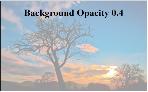
You can use CSS psuedo selector ::after to achieve this. Here is a working demo.

enter image description here

_x000D_
_x000D_
.bg-container{_x000D_
  width: 100%;_x000D_
  height: 300px;_x000D_
  border: 1px solid #000;_x000D_
  position: relative;_x000D_
}_x000D_
.bg-container .content{_x000D_
  position: absolute;_x000D_
  z-index:999;_x000D_
  text-align: center;_x000D_
  width: 100%;_x000D_
}_x000D_
.bg-container::after{_x000D_
  content: "";_x000D_
  position: absolute;_x000D_
  top: 0px;_x000D_
  left: 0px;_x000D_
  width: 100%;_x000D_
  height: 100%;_x000D_
  z-index:-99;_x000D_
  background-image: url(https://i.stack.imgur.com/Hp53k.jpg);_x000D_
  background-size: cover;_x000D_
  opacity: 0.4;_x000D_
}
_x000D_
<div class="bg-container">_x000D_
   <div class="content">_x000D_
     <h1>Background Opacity 0.4</h1>_x000D_
   </div>_x000D_
</div>
_x000D_
_x000D_
_x000D_


I had a similar issue and I just took the background image with photoshop and created a new .png with the opacity I needed. Problem solved without worrying about if my CSS worked accross all devices & browsers


I had a similar issue. I had an image and wanted to reduce the transparency and have a black background behind the image. Instead of reducing the opacity or creating a black background or any secondary div I set a linear-gradient to the image all on one line:

_x000D_
_x000D_
background: linear-gradient(to bottom, rgba(0, 0, 0, 0.8) 0%, rgba(0, 0, 0, 0.8) 100%), url("/img/picture.png");
_x000D_
_x000D_
_x000D_